

Diverging bar charts, also known as “bikini charts,” are a fantastic way to compare two opposing metrics or categories. Unlike traditional side-by-side bar charts, diverging bar charts place the bars opposite each other with a shared Y-axis in the middle, making comparisons intuitive and visually striking.
In this tutorial, I’ll show you how to create a diverging bar chart using Tableau’s Superstore dataset. Our goal is to compare sum sales across regions.
Step 1: Set Up the View
- Open Tableau and connect to the Sample – Superstore dataset.
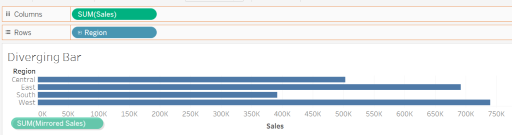
- Drag Region to the Rows shelf.
- Drag Profit to the Columns shelf, and make sure the aggregation is Sum.
Step 2: Create a Mirrored Measure for Diverging Bars
To create the diverging effect, we need to invert one of the measures (in this case, Profit):
- Create a calculated field for Mirrored Sales:
- Go to the Analysis menu and select Create Calculated Field.
- Name it Mirrored Sales and use the following formula:
-[Sales].
- Grab it and drag it to the view below the x-axis to create a shared axis view like this: (NOTE: you should see two green horizontal bars)
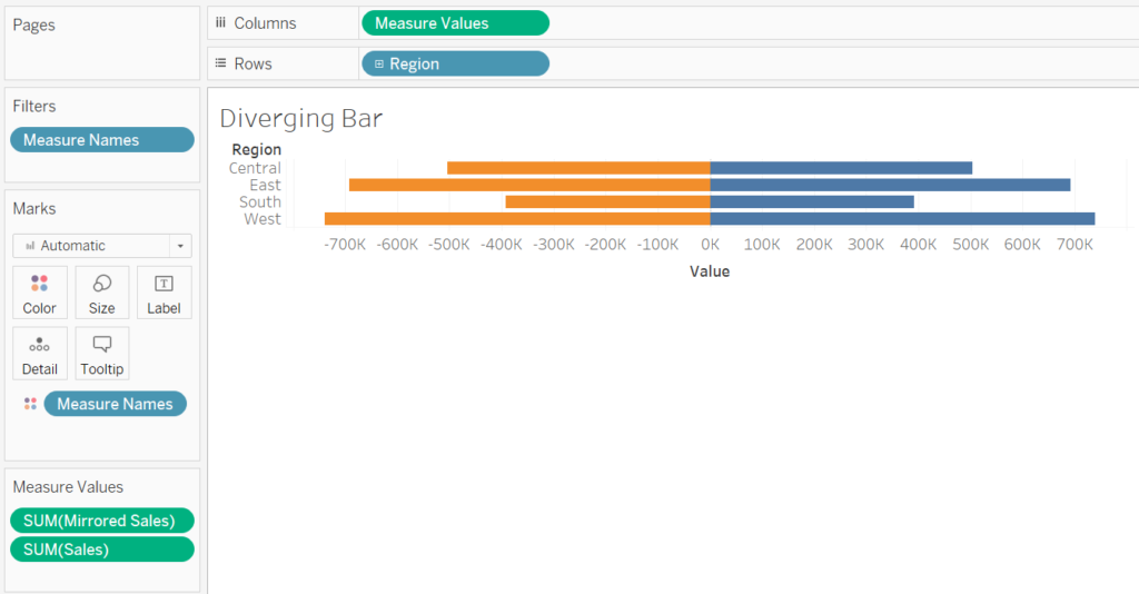
Step 3: Combine the Measures
To create a shared axis:
- Drag the Measure Names pill from the Data Pane to the Rows shelf.
- Tableau will now display both Sum Sales and Mirrored Sales as separate rows.
- Drag Measure Names to the Color shelf in the Marks card to distinguish the two measures.
Step 4: Format the View
Adjust Colors
- Click the Color card and edit the palette:
- Assign one color (e.g., blue) for Average Profit and another (e.g., orange) for Mirrored Profit.
- Avoid colors that clash or make the chart difficult to read.
Sort the Bars
- Right-click the Region pill in the Rows shelf and select Sort.
- Choose Field under Sort By, select Descending, and choose Sales as the field to sort by.
Format the Axis
- Right-click the Measure Values axis and select Format.
- Under Numbers, choose a custom format such as
#,##0,,M;-#,##0,,Mto display values in millions and remove negative signs.
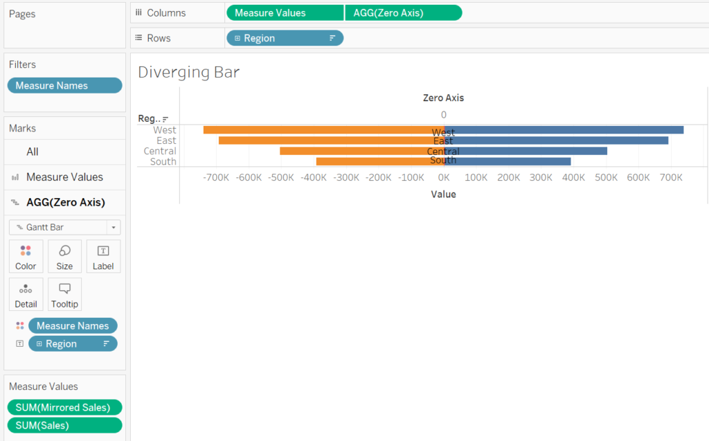
Step 5: Add Region Labels to the Bars
To make the chart more readable, we’ll add the region names in the middle of the bars:
- Create a calculated field:
- Name it Zero Axis and set the formula to:
AVG(0)
- Name it Zero Axis and set the formula to:
- Drag Zero Axis to the Columns shelf.
- Right-click the newly created axis and select Dual Axis.
- Tableau will default to a scatterplot for the Zero Axis. Change its mark type to Gantt Bar in the Marks card.
Position the Labels
- Drag the Region field to the Label shelf under the Zero Axis marks.
- Click the Label card, align the text to Center and Middle, and adjust the font color to white.
- If needed, make the text bold or increase its size for better readability.
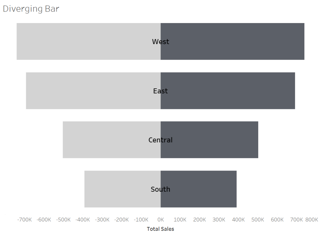
Step 6: Final Touches
Hide Unnecessary Headers
- Right-click the axis labeled 0 and uncheck Show Header.
- Repeat this for the Region header to clean up the view.
Adjust Bar Sizes
- Use the Size slider in the Marks card to make the bars thinner or thicker, depending on your preference.
Why Use a Diverging Bar Chart?
Diverging bar charts are perfect for:
- Comparing metrics like sales and profit, inbound and outbound flows, or sentiment scores.
- Highlighting performance where one metric is positive (e.g., profit) and another is negative (e.g., loss).
- Saving space compared to side-by-side bar charts while maintaining clarity.
With a diverging bar chart, you can effectively compare two measures in a visually engaging way. Using Tableau’s Superstore dataset, this guide demonstrates how to build one step by step. Apply these techniques to your own datasets to deliver insightful and professional visualizations.
Happy visualizing!