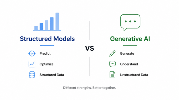
Over the past two years, Generative AI has dominated headlines.
ChatGPT can write emails.
Claude can summarize documents.
LLMs can answer questions, generate code, and even perform research.

Over the past two years, Generative AI has dominated headlines.
ChatGPT can write emails.
Claude can summarize documents.
LLMs can answer questions, generate code, and even perform research.
Over the past two years, artificial intelligence has rapidly entered the world of data and analytics. Large language models can now write SQL, explain trends, generate dashboards, and summarize reports in seconds. Because of this, a common question is starting to appear in data teams and executive meetings:
Continue reading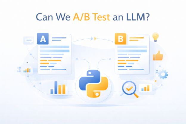
As large language models (LLMs) move from demos into production systems, one question comes up quickly:
Can we A/B test an LLM like we test product features?
For teams coming from product analytics or growth, the instinct is straightforward:
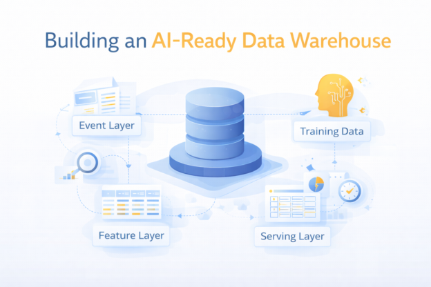
Most companies don’t fail at AI because of models. They fail because of data.
More specifically:
Continue readingThey try to run AI workloads on top of a data warehouse that was never designed for it.
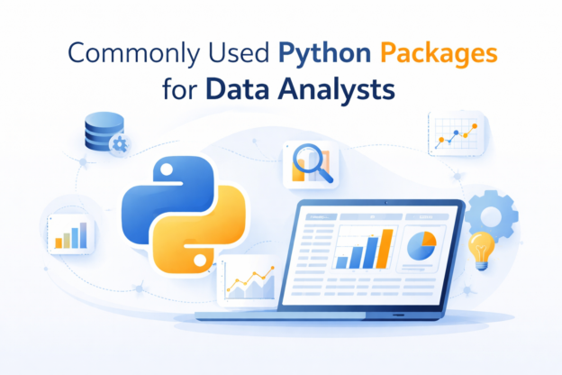
If you’re working as a data analyst today, Python is no longer just a “nice to have.” It’s part of the daily toolkit.
But here’s the reality:
Continue readingMost analysts don’t need dozens of libraries — they need a small, reliable stack, used well.
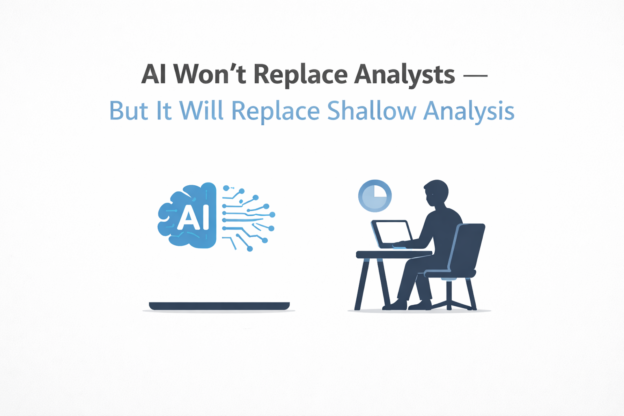
AI is getting uncomfortably good at the parts of analytics that used to look impressive.
It can:
So it’s natural to wonder: Will AI replace analysts?
Continue reading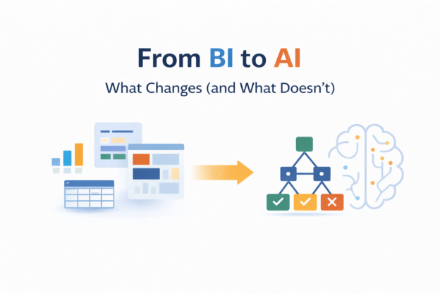
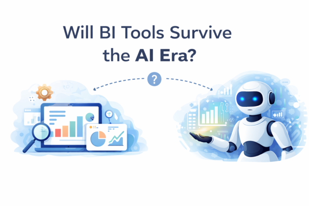
Over the last few years, “AI transformation” has become a board-level conversation.
Executives ask:
Underneath the noise, a more important question exists:
Continue readingWhat actually changes when an organization moves from BI to AI?
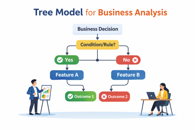
Tree models are among the most widely used machine learning methods in modern business systems.
From fraud detection and churn prediction to logistics risk scoring and pricing optimization, tree-based models power decisions across industries.
Continue reading
Most analysts start experiment analysis in SQL.
You write a query.
You compare treatment vs control.
You calculate lift.
You declare a winner.
For many well-designed A/B tests, that’s perfectly valid.
Continue reading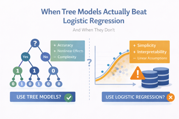
If you work in applied data science long enough, you’ll eventually hear some version of this question:
“Should we switch from logistic regression to a tree-based model?”
Sometimes the answer is yes.
Very often, the answer is not really.