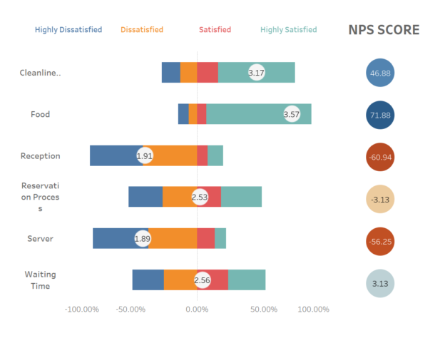
Surveys are powerful tools for gathering feedback and insights, with Likert scales and Net Promoter Score (NPS) being two popular methods for measuring attitudes, opinions, and customer satisfaction. Likert scales assess the level of agreement or disagreement on a statement, while NPS measures customer loyalty by asking how likely respondents are to recommend a product or service.
Visualizing these survey responses effectively can help businesses quickly grasp insights, and Tableau offers robust functionality for creating meaningful charts for both Likert scales and NPS scores.
In this article, we will guide you through the steps of creating Likert scale and NPS score charts in Tableau.
1. Creating a Likert Scale Chart in Tableau
What is a Likert Scale?
A Likert scale typically asks respondents to rate their level of agreement on a scale (e.g., Strongly Agree, Agree, Neutral, Disagree, Strongly Disagree). Visualizing this data helps in understanding the distribution of responses and analyzing customer sentiment.
Step-by-Step Guide to Creating a Likert Scale Chart
Step 1: Prepare Your Data We will use restaurant survey data, which includes the survey category, customer responses, and scores—these are the three key data points necessary for building the dashboard.
Step 2: Create Calculated Field We need to create a few calculated fields, which we’ll explain step by step, so don’t worry. For reference, my data source includes fields like “Answer” (a dimension) and “Score” (a measure). If your survey data only has score values and you need more descriptive, user-friendly fields, you can easily achieve this by using a CASE WHEN statement to convert them.
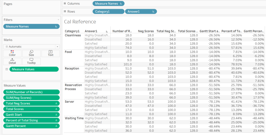
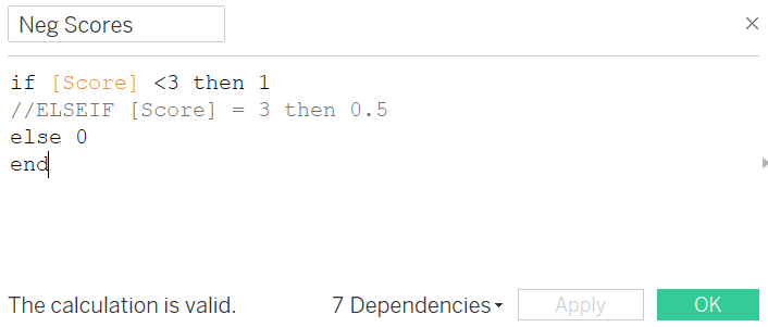
First, we want to define what constitutes a negative score. On a scale from 0 to 5, we’ll consider any score below 3 as a negative record (although “negative records” might have been a clearer name than “negative scores,” let’s stick with the current naming for now). For example, we can see that there are 18 negative records for [Cleanliness][“Highly Dissatisfied”] and 16 for [Cleanliness][“Dissatisfied”].
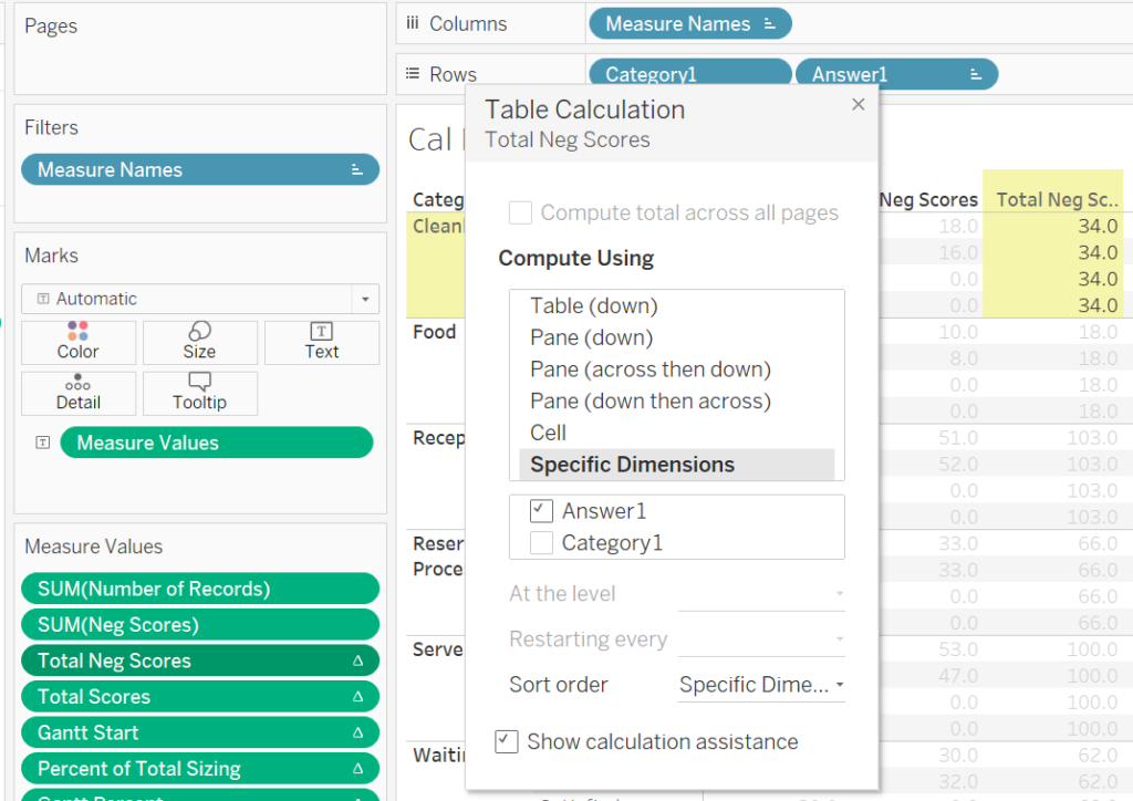
Building on this, we now need to determine the total number of negative records across all answers for each question. This is where we introduce a table calculation, which gives us a total of 34 negative records. This matches what we calculated earlier.
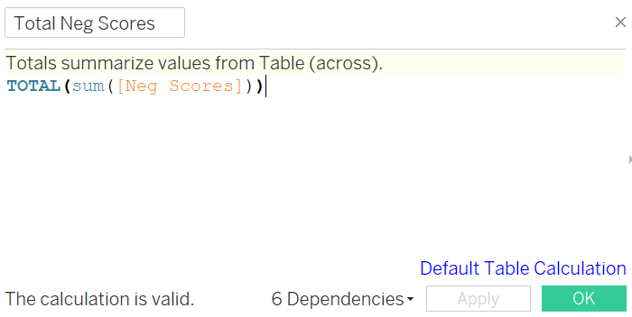
Using the same logic, we now need to calculate the total number of survey records (again, please disregard the less-than-ideal naming). This will also be done using a Table Calculation.
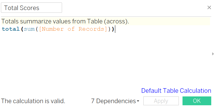
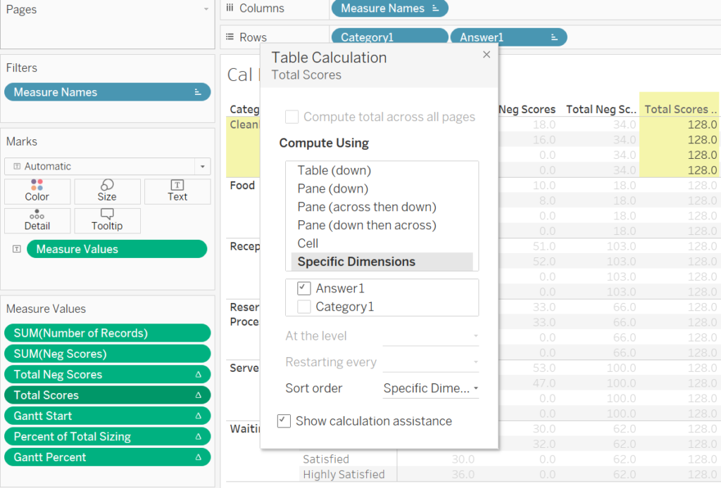
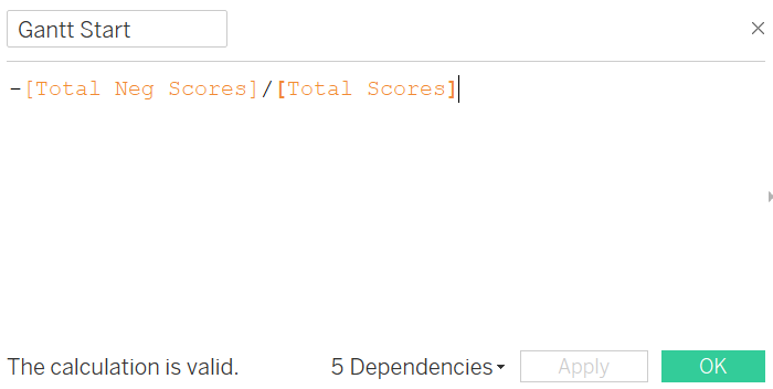
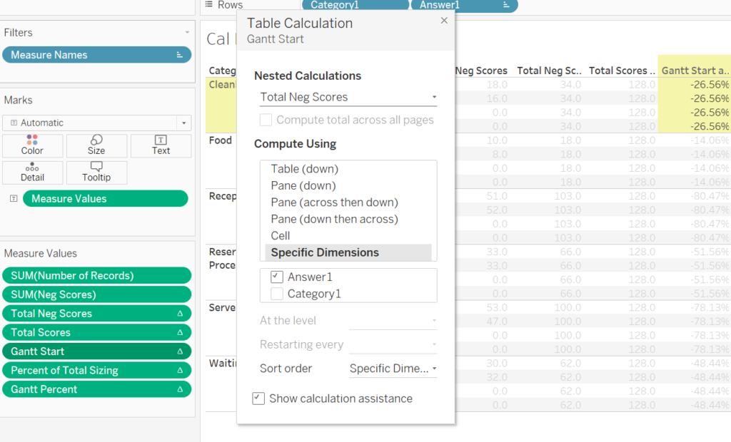
With the Total Negative Scores and Total Scores, we can calculate the percentage of negative responses for each answer by simply dividing them. This value serves as the starting point for our Gantt chart, which we’ll call “Gantt Start.” Don’t forget to add a negative sign—we’ll understand why that’s important later. Additionally, to ensure consistency across each category, we’ll apply a table calculation here as well.
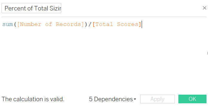
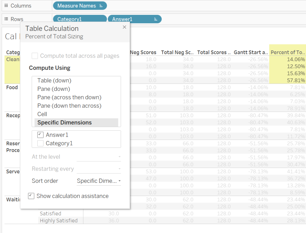
The next field calculates the size of each answer on the Gantt chart. This is done by dividing the number of records for each answer by the total number of records.
And sure enough, we will apply the same Table calculations.
The final calculation, and the most complex one, is to determine the ending point of each answer on the Gantt chart. If you recall from earlier steps, the starting point for “Highly Dissatisfied” under cleanliness is -26.56%, and that answer accounts for 14.06%. This means it should end at -26.56% + 14.06% = -12.50%, which also becomes the starting point for the next answer, “Dissatisfied.” Following the same logic, the starting point for “Satisfied” should be -12.50% + 12.50% = 0, and “Highly Satisfied” would start at 0 + 15.63%. The following Tableau expression handles this calculation.
PREVIOUS_VALUE([Gantt Start])+
zn(LOOKUP([Percent of Total Sizing],-1))
Previous_Value returns the value of this calculation in the previous row.
LOOKUP() function, Tableau returns a table with the previous value shifted and aligned with the current value.
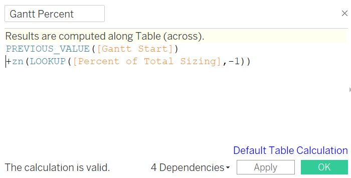
And of course, we need to add table calculation to it.
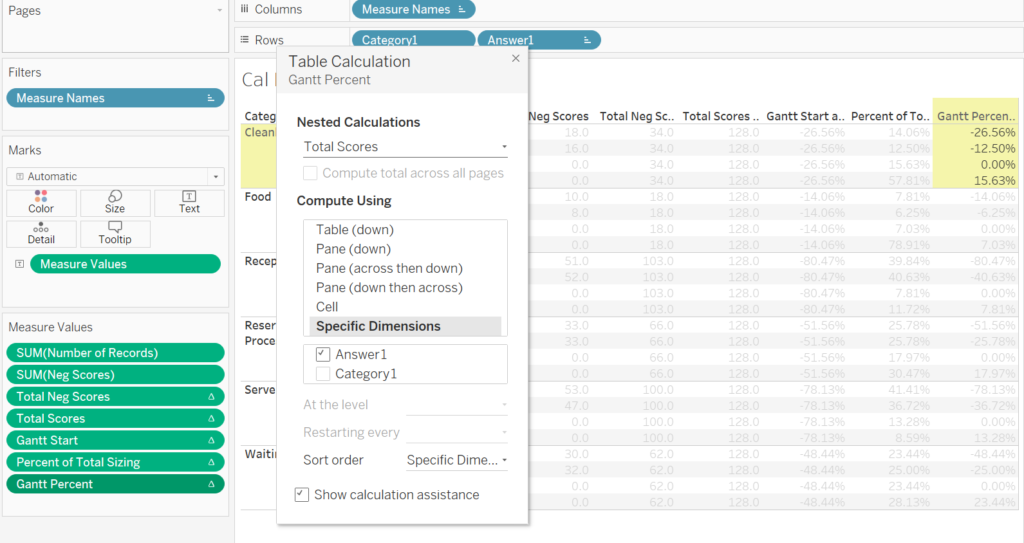
Step 3: Make the report Now that we have all the necessary fields, it’s time to put them into action and create a Likert scale.
First, drag the Category field into the rows section.
Next, drag Gantt Percent into the columns section. You’ll notice that Tableau might prompt you about a missing field for Gantt Percent—this can be resolved by bringing the Answer field into the view and placing it on the Color shelf. Finally, change the chart type from automatic to Gantt Bar.
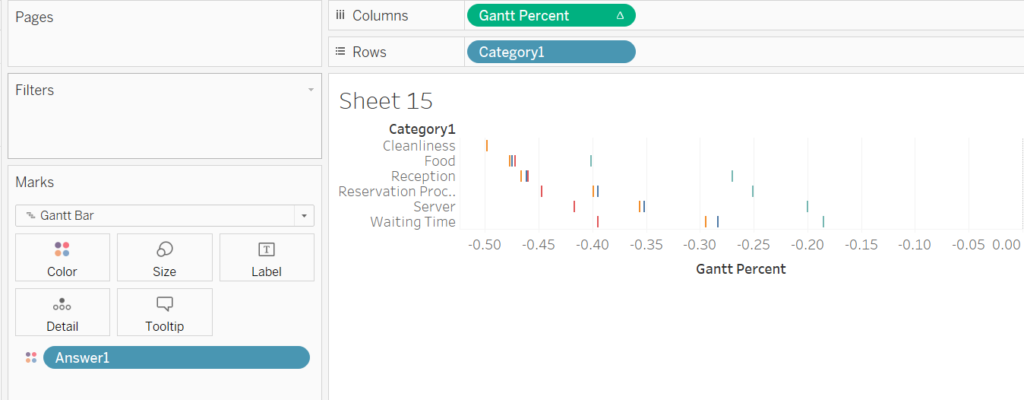
Next, we’ll bring in our Percent of Total Sizing field and place it on the Size shelf, then adjust the color palette. However, the bars may not display correctly with the default table calculation. To fix this, we need to update both the Gantt Percent and Percent of Total Sizing fields to use a table calculation along the Answer field.
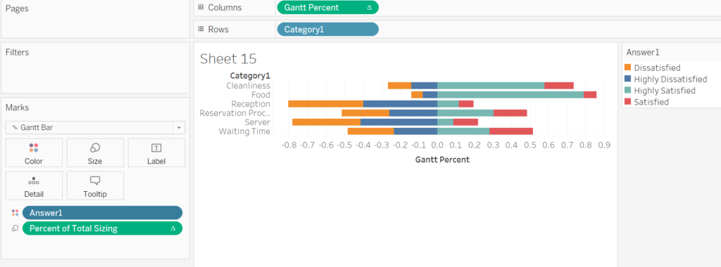
You may notice that the answers are out of order. To fix this, we can manually sort them so that they start from the most unsatisfied and progress to the most satisfied.
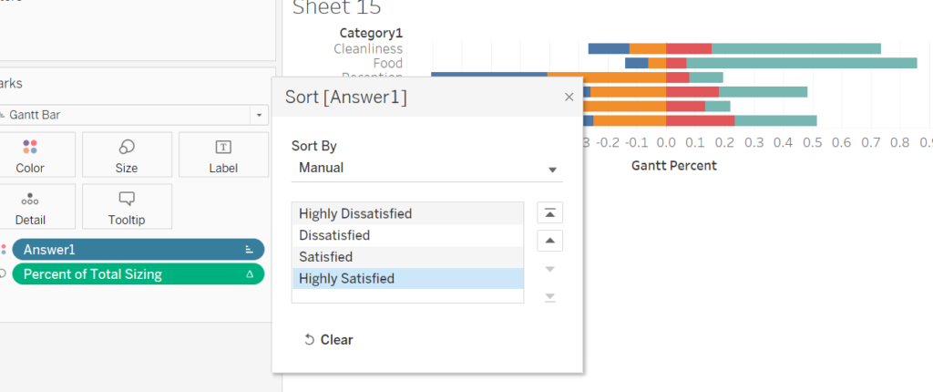
It’s looking great so far, but we can enhance it by highlighting the average score on each bar. To do this, drag the Score field to the columns shelf, aggregate it by average, and make it a dual-axis chart. Then, change the mark type to circle and drag the Avg(Score) field onto the label.
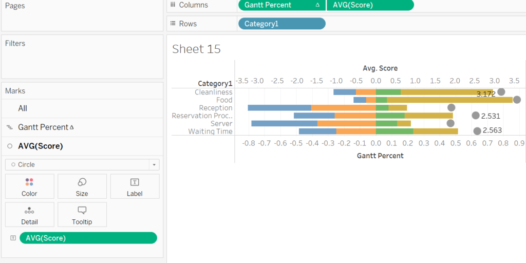
You might notice that the average scores are positioned outside the bars. No worries—we can fix this by adjusting the Avg. Score axis to range from 1 to 5 and the Gantt Percent axis to range from -1 to 1. After that, hide the top header, apply some formatting, and tweak the colors. With these adjustments, you’ll have a clean, polished Likert scale chart.
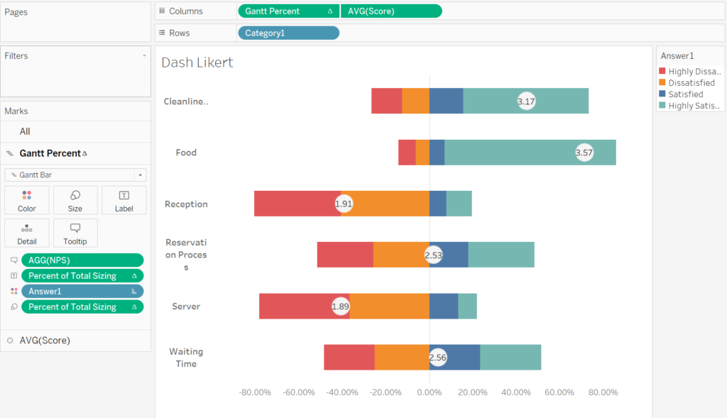
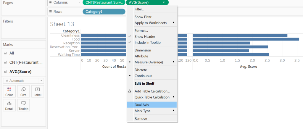
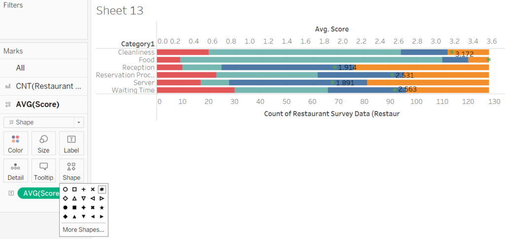
Alternative Solution If you prefer to keep things simpler, you can create a traditional bar chart that’s just as effective. I’m attaching a few screenshots of how I set this up—I’m confident you’ll be able to figure out the steps to get there.
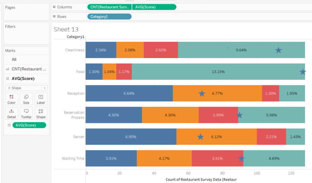
Thanks for reading! I hope you’ve found this helpful. We’ve covered quite a bit already, so we’ll continue in the next post, where we’ll dive into how to create a Net Promoter Score. Stay tuned!

