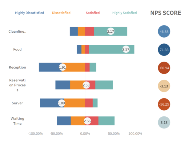
Be sure to check out my previous article on creating a Likert scale, as we’ll be using the same restaurant survey dataset. However, we won’t be using any of the calculated fields from the Likert scale, so feel free to skip it if you’d like. That said, the final dashboard will feature both the Likert and NPS charts side by side—they always pair well together, don’t you think?
What is NPS?
Net Promoter Score (NPS) is a measure of customer loyalty, typically calculated by asking customers, “On a scale of 0 to 5, how likely are you to recommend our product or service to others?” Based on their response, customers are grouped into three categories:
- Promoters are those who rate 4-5.
- Passives are those who rate 3.
- Detractors are those who rate 1-2.
Create Calculated Fields for NPS Categories To categorize respondents as Promoters, Passives, or Detractors based on a 1-5 scale, use the following calculated field:
IF [Score] = 5 THEN 'Promoter'
ELSEIF [Score] = 4 THEN 'Promoter'
ELSEIF [Score] = 3 THEN 'Passive'
ELSE 'Detractor'
END
Calculate the NPS To calculate NPS, create the following calculated fields:
% Promoters:
COUNTD(IF [NPS Category] = 'Promoter' THEN [Respondent ID] END) / COUNTD([Respondent ID])% Detractors:
COUNTD(IF [NPS Category] = 'Detractor' THEN [Respondent ID] END) / COUNTD([Respondent ID])Finally, calculate the NPS score:
- NPS Score:
[% Promoters] - [% Detractors]Alright, now that we understand the general concept, let’s return to the dataset and see how we can calculate the NPS score. If you’re like me and prefer a more streamlined approach, you can embed both the % Promoters and % Detractors directly into the final NPS calculation. This would look something like this:
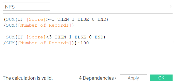
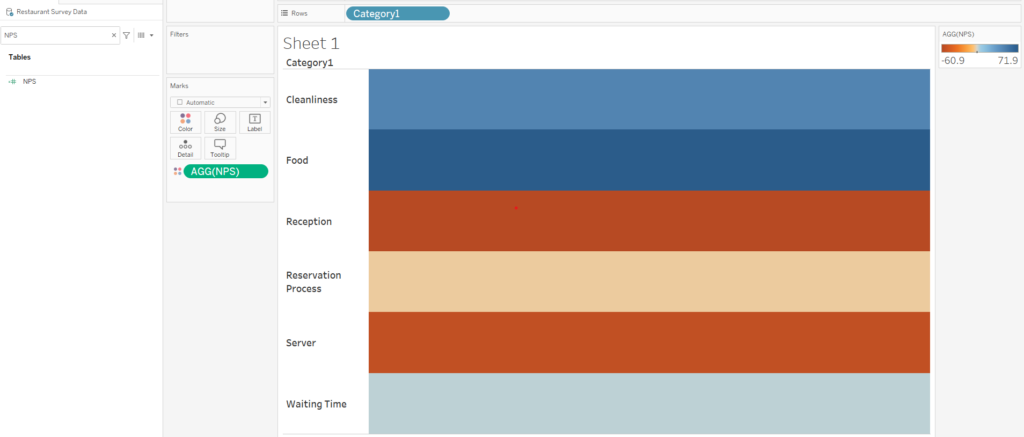
Now let’s drag category to row shelf and NPS to colors
Switch the marks card from automatic to circle, then drag the NPS field to Labels, and that’s it—you’re almost there!
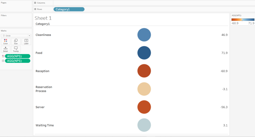
I prefer not to display the category names, and I want the labels inside the circles. To achieve this, I’ll uncheck “Show Header” and ensure the labels are centered within the circles.
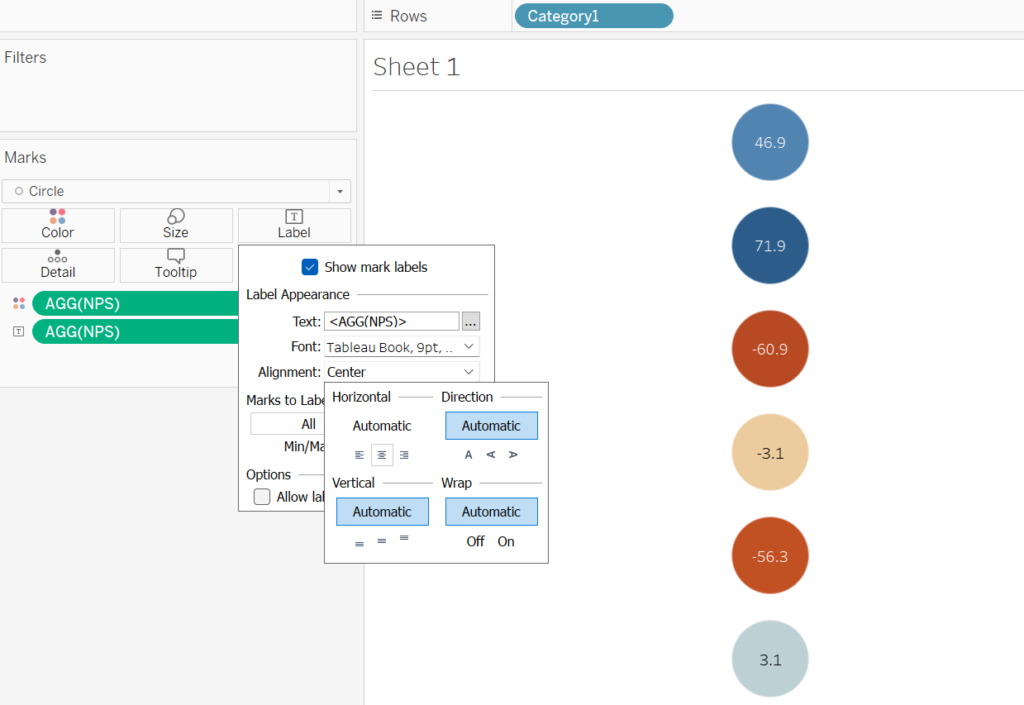
And voilà, you’ve got yourself a beautiful NPS chart!
Check out the final dashboard with both Likert and NPS : https://public.tableau.com/app/profile/white.gloves/viz/Likert-RestaurantSurveyData/Dashboard

