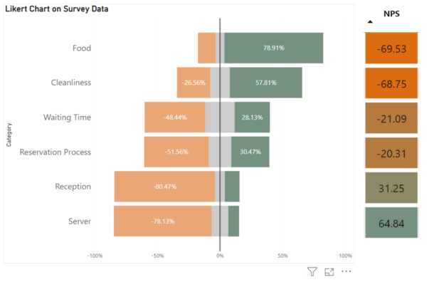
If you’ve read my previous tutorial on creating Likert Scale and NPS scores in Tableau, you might have found yourself wondering: how can I achieve the same in Power BI? The good news is, Power BI offers a straightforward way to replicate this process while leveraging its powerful visualization and data modeling features.
In this guide, we’ll use the same data source to ensure consistency and focus on creating measures tailored for Power BI. We’ll start by creating a couple of measures that differ from the ones we built in Tableau. Specifically, we’ll calculate the count for each rating category, which will serve as the foundation for our visualizations and deeper insights. Power BI’s unique features provide flexibility, making it simple to design visually compelling representations of survey data like Likert Scale and NPS. Let’s dive in and explore how we can use DAX and Power BI’s tools to bring your survey data to life.

Positive Count =
    CALCULATE(
        COUNTA(Survey[Score]),
              FILTER(Survey, Survey[Score] in {4,5}
              )
    )
The same logic applies when calculating the negative count. The only difference here is that, since we’re dealing with negative values, we want to multiply the count by -1 to make it negative. This allows us to easily distinguish negative responses from positive ones in our analysis and visualizations. By adding -1 * to our measure, we ensure that the values are represented correctly in our charts.
Negative Count =
    -1*CALCULATE(
        COUNTA(Survey[Score]),
              FILTER(Survey, Survey[Score] in {1,2}
              )
    )
For the neutral count, we divide it into two equal halves to balance the representation across both positive and negative sides. Essentially, we create two measures: one for the negative half and one for the positive half. This approach helps maintain an unbiased view of neutral responses, ensuring they contribute proportionately to both sides of the analysis.
Neutral Count N =
    -0.5 * CALCULATE(
        COUNTA(Survey[Score]),
              FILTER(Survey, Survey[Score] =3
              )
    )
Neutral Count P =
0.5 * CALCULATE(
COUNTA(Survey[Score]),
FILTER(Survey, Survey[Score] =3
)
)Then we will need to calculate the percentage of each count against total count.
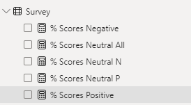
Next, we’ll calculate the percentage of each count against the total count. By dividing each count—whether it’s positive, negative, or neutral—by the total number of responses and multiplying by 100(we can either do this in the measures or via data formatting), we obtain the percentage representation of each category.
% Scores Positive =
DIVIDE([Positive Count],[Total Scores],0)
Lastly, we need to create two measures for NPS. The first measure is quite straightforward: it calculates the NPS by subtracting the percentage of detractors (negative responses) from the percentage of promoters (positive responses). Because our negative responses measure is already negative, we need to add them together.

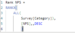
The second measure is the NPS Rank, which we use as a criterion for sorting. To create this measure, we use a ranking function, which assigns a numerical rank to each NPS value in descending order. This way, categories with higher NPS scores are ranked higher, making it convenient to sort and analyze the data.
With all the preparations complete, we can now effortlessly create a compelling visualization. Start by selecting a simple bar chart in Power BI. Drag and drop the “Category” field onto the Y-Axis to represent the different segments you’re analyzing. Next, place the percentage measures (positive, negative, and neutral percentages) onto the X-Axis.
To finalize the visual, use the NPS Rank as the sorting criterion, and there you have it
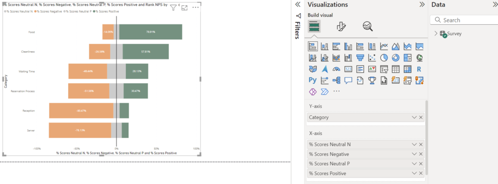
Apply some formatting tweaks, your bar chart will look much more polished and professional.
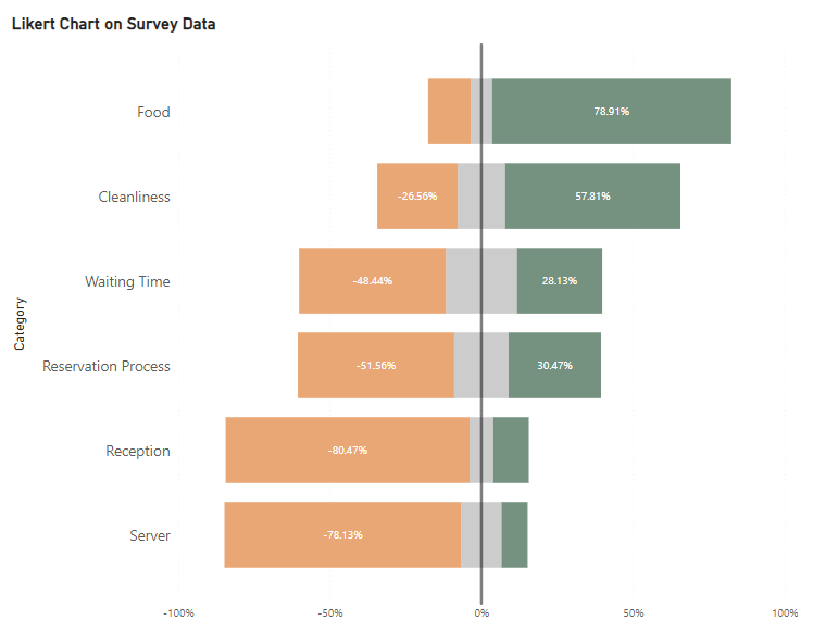
After formatting your bar chart, you can add a table next to it to display the NPS score for each category.
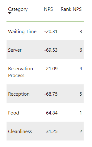
After applying final formatting and realigning, you now have the Likert bar chart and the NPS table positioned side by side, just as you would in Tableau. (Drag in between columns to hide unwanted ones and apply back ground color under Cell elements)


