

A waffle chart is a highly effective visualization for showing progress toward a goal or illustrating percentages as part-to-whole relationships. This grid-based chart uses a 10×10 structure to represent percentages, with each square equating to 1% of the total.
In this blog post, we’ll guide you through creating a waffle chart in Tableau, step by step, using a simple and reusable method.
Why Use a Waffle Chart?
Waffle charts are ideal for:
- Representing percentages in a visually engaging way.
- Tracking progress toward a target (e.g., KPI achievement).
- Displaying part-to-whole relationships clearly.
Unlike pie charts, waffle charts provide a structured and precise way to show proportions, especially when combined with supporting text or metrics.
Step 1: Prepare the Data
To create a waffle chart, you’ll need a data scaffold to generate the 10×10 grid.
- Create a Grid Dataset:
- Use a tool like Excel or Google Sheets to create two columns:
XandY. - Populate the
Xcolumn with numbers from 1 to 10 and theYcolumn with numbers from 1 to 10. - This will create a 10×10 grid when plotted in Tableau.
- Support sheet that we can easily download from this link.
- Use a tool like Excel or Google Sheets to create two columns:
- Once downloaded, connect this file as a new data source in Tableau, aside the original superstore datesource.
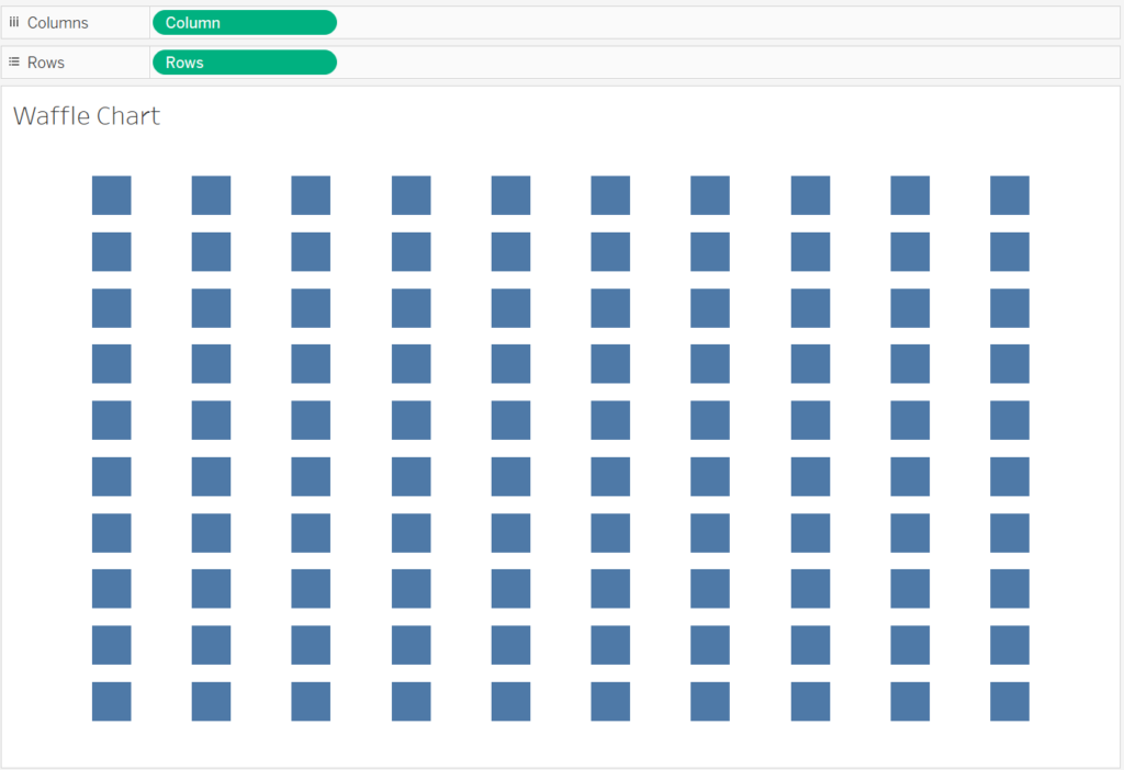
Step 2: Build the Waffle Chart Grid
- Convert Fields to Dimensions
- Right-click on the Rows and Columns fields in the data pane and convert them to Dimensions.
- Drag Rows to the Rows shelf and Columns to the Columns shelf.
- Right-click on the Rows pill in the Rows shelf to Sort Descending.
- Change the Mark Type to Square
- On the Marks card, change the mark type to Square.
- Resize the Table
- Drag the edges of the table (from the bottom and the right-hand side) to enlarge the visualization.
- Use the Size slider on the Marks card to adjust the size of the squares, ensuring they fit together neatly without gaps.
- Hide Headers and Remove Row Dividers
- Right-click on the headers for both Rows and Columns and select Hide to declutter the view.
- Go to Format and remove unnecessary lines between rows.
Step 3: Create Calculated Fields for the Color of Waffle Chart
Click on the original data source (Sample – Superstore) and start creating calculated fields.
To represent the sales of each region as a percentage in the waffle chart, I created calculated fields named East Region, West Region, Central Region, and South Region, based off [Region] field and following this formula for each region:
SUM(IF [Region] = 'East' THEN [Sales] END) / SUM([Sales])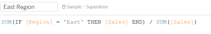
Once this part is done, switch to the template dataset and create a new calculated field.
IF avg([Percentage])<=
    [Sample - Superstore].[West Region] then 'West'
ELSEIF avg([Percentage])<=
    [Sample - Superstore].[West Region] + [Sample - Superstore].[East Region] then 'East'
ELSEIF avg([Percentage])<=
    [Sample - Superstore].[West Region] + [Sample - Superstore].[East Region]
    + [Sample - Superstore].[Central Region] then 'Central'
ELSE "North"
END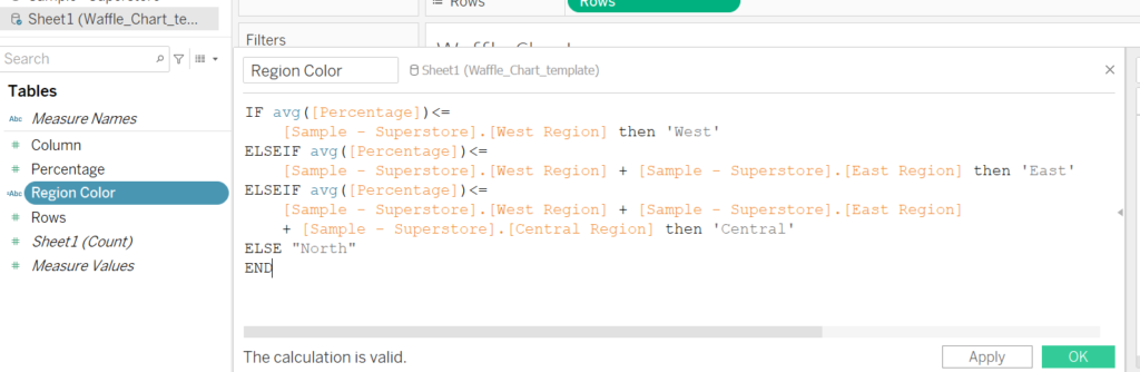
Because it will be used on color, I call it region color and let’s drag it to “Color” under Marks, pick your color options and that is it!
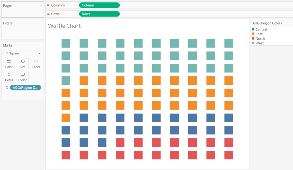
Waffle charts are an excellent way to showcase percentages with a clean, grid-based visualization. By following these steps in Tableau, you can create a waffle chart that not only communicates key metrics effectively but also adds a creative element to your dashboards.
Experiment with different metrics, color schemes, and layouts to customize the chart for your audience, and you have a nice Waffle chart to go!