
Dumbbell charts are a fantastic visualization tool for comparing two data points across categories while emphasizing the difference between them. Often used to show progress or change over time, these charts highlight how values diverge or converge for each category. In this blog post, we’ll walk you through how to create a dumbbell chart in Tableau using the Superstore dataset.
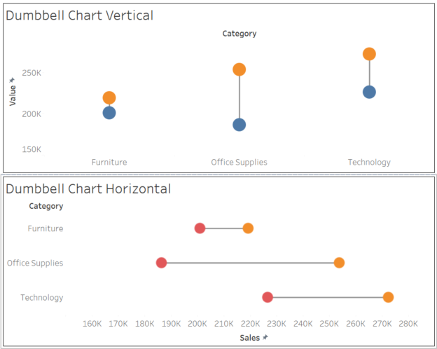
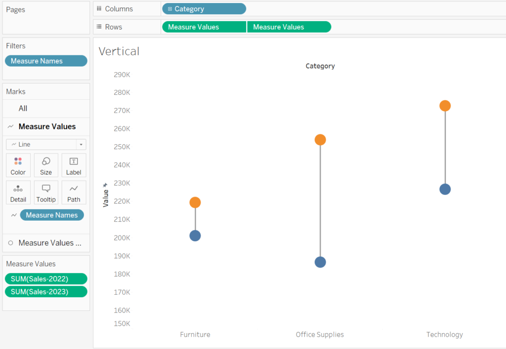
Create a Dumbbell Chart — Vertical
Step 1: Connect to the Superstore Dataset
- Open Tableau and connect to the Sample – Superstore dataset.
- Navigate to a new worksheet.
Step 2: Build the Foundation for the Dumbbell Chart
To create a dumbbell chart, we need to plot two data points for each category and connect them with a line.
Create the Measures
To distinguish the data points, you want to create two measures indicating the starting point and end point. In this case, I am using Sales for year 2022 and 2023.
Sales(2022)
if year([Order Date]) = 2022 THEN [Sales] END

Sales(2023)
if year([Order Date]) = 2023 THEN [Sales] END
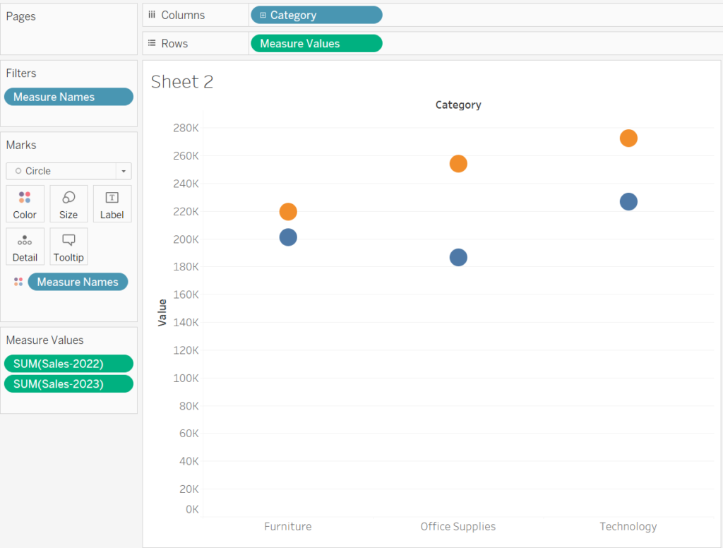
Add Dimensions and Measures
- Drag Category to the Columns shelf.
- Drag Sales-2022 to the Rows shelf.
- Then drag Sales-2023 onto the canvas, and release your mouse at the point it is over the Sales-2022 axis and the 2 green columns symbol appears.
- Drag the Measure Name field from Columns to Color and change marks to Circle
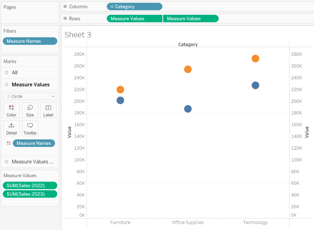
Step 3: Create a Dual-Axis Chart
- Add another Measure Values to Rows shelf alongside the existing one.
- Right-click the second Measure Values pill and select Dual Axis.
- Right-click one of the axes and choose Synchronize Axis.
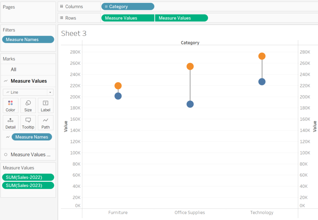
Step 4: Add Connecting Lines
To create the “dumbbell” effect, we need to convert the second set of measure values from circle to lines.
- For the FIRST Measure Values mark card, change the mark type to Line.
- Drag Measure Names to the Path shelf, and you will see a line connecting the dots.
Step 5: Format and Finalize the Dumbbell Chart
Adjust Line Formatting
- In the Marks card for the line:
- Increase the line thickness to make the connections more visible.
- Choose a neutral color like gray for the lines to avoid overpowering the circles.
Customize Circle Colors
- Assign different colors to the circles for better distinction:
- For Sales (2022), use a lighter color.
- For Sales (2023), use a darker color or a color that contrasts well with the first.
Add Data Labels
- Drag the Sales field onto the Label shelf for each circle.
- Format the labels to show exact sales values, or include a unit (e.g., “$K”).
Remove Gridlines:
- Go to Format > Lines and set all gridlines and borders to None for a clean look.
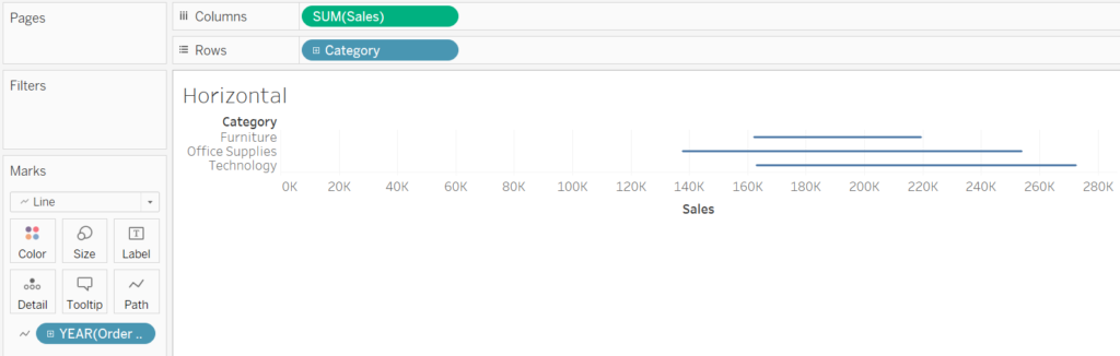
Create a Dumbbell Chart — Horizontal
The above steps outlines how to create a vertical Dumbbell chart, we can also create a horizontal Dumbbell chart and that is even easier!
1. Drag the Category dimensions to rows and drag the Sales measure to columns
2. Change the default chart type on the marks shelf to a line
3. Then drag the Year(Order Date) dimension to Path on the mark shelf
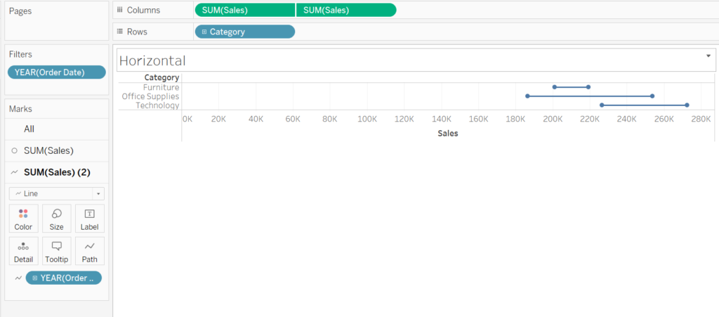
4. Drag the Year(Order Date) dimension to the filters shelf, select Years and click 2022 and 2023
5. Drag the Sales measure to columns again, but this time change the second chart type to a circle
6. Left click on SUM(Sales) and select dual axis
7. Right click the top axis and deselect ‘show header’, then right click on the bottom axis to synchronise axis
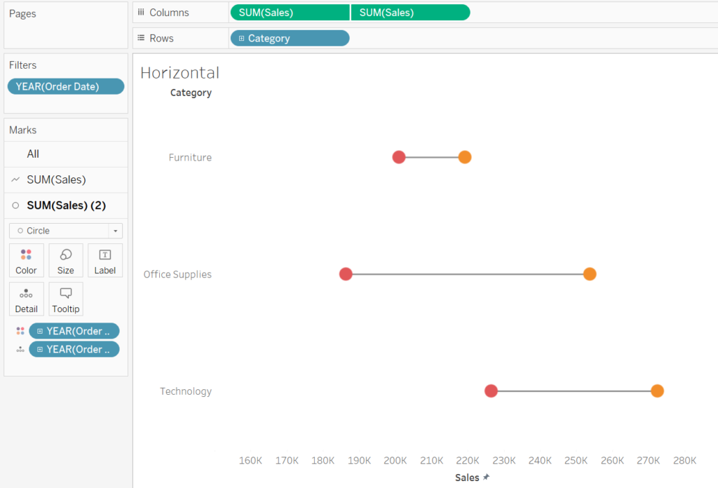
8. On the marks shelf where the chart type is a circle, drag Year(Order Date) to colors
9. Remove gridlines and add other formatting steps as needed
Why Use Dumbbell Charts?
Dumbbell charts are particularly useful for:
- Before-and-After Comparisons: Compare metrics across time periods, such as sales or profit growth.
- Category Gaps: Highlight disparities between categories, such as regional performance.
- Progress Tracking: Show the change from baseline to target values.
Conclusion
Dumbbell charts are an elegant way to compare two data points while emphasizing the difference between them. With Tableau’s flexibility, you can easily create a dumbbell chart using the steps above and adapt it to your dataset.
Incorporate dumbbell charts into your dashboards to present comparisons more effectively and enhance your storytelling. Experiment with formatting, colors, and tooltips to tailor the visualization to your audience. Happy visualizing!