

Unit progress bar charts are a fantastic way to represent progress toward a goal, breaking the visualization into smaller units to highlight individual contributions. These charts are both visually appealing and effective for storytelling. In this post, we’ll guide you through the process of creating a unit progress bar chart in Tableau using the Superstore dataset.
What Is a Unit Progress Bar Chart?
A unit progress bar chart breaks down a single metric (like sales, profit, or order count) into smaller visual units, showing incremental progress toward a goal. This granular approach makes it easier to see how far you’ve come and how much remains.
Steps to Create a Unit Progress Bar Chart
Step 1: Add a Constant Field to the Columns Shelf
- Open Tableau and connect to the Superstore dataset.
- Identify the measure you want to track (e.g., Sales) and define the goal or target value (e.g., $1 Million in total sales).
- In the Columns shelf, double-click and enter the value
1000000. - Tableau will create a green pill labeled SUM(1000000), representing the sum of a constant value (1000000). This will serve as the baseline for your progress chart.
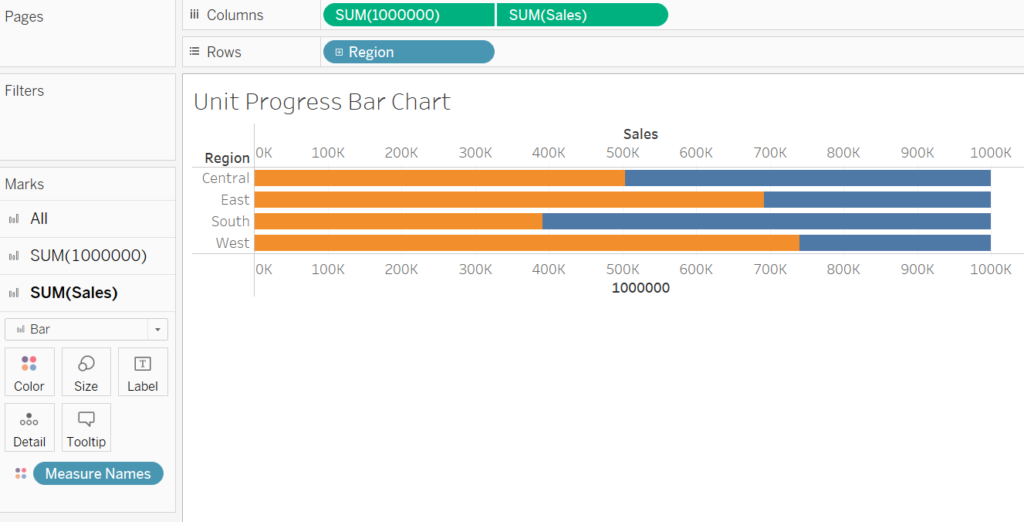
Step 2: Build the Stacked Bar Chart
- Drag the Region dimension to the Rows shelf.
- Drag the Sales measure to the Columns shelf.
- Right-click SUM(Sales) in the Columns shelf and select Dual Axis.
- Right-click on either axis and choose Synchronize Axis to ensure both axes are scaled identically.
- If the chart type changes, go to the Marks card and select Bar for both axes.
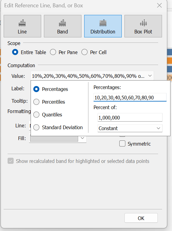
Step 3: Add a Distribution Band
- Open the Analytics pane on the left sidebar.
- Drag the Distribution Band option onto the View and drop it over SUM(1000000).
- In the Distribution Band Edit window, do the following:
- Under Computation, select Constant instead of Average.
- Change the percentages to define intervals, e.g., 10, 20, 30, …, 90.
- Set Label and Tooltip to None to declutter the chart.
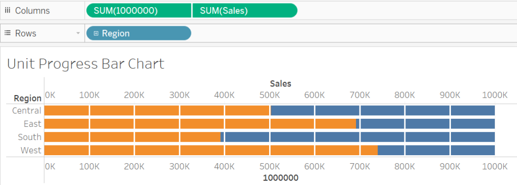
Step 4: Format the Distribution Band
- In the Formatting section of the Distribution Band Edit window:
- Change the Line Color to white and increase the thickness for better visibility.
- Set the Fill Color to None to remove background shading. Click OK to apply changes.
- To remove any residual gray shading, right-click on the chart, select Format, and set the Fill Color to None in the Format Pane.
Step 5: Customize the Chart
Choose Field under Sort By, Descending under Sort Order, and Sales under Field Name. This ensures that regions with the highest sales appear at the top.
- Adjust View Size:
On the toolbar, click the Standard dropdown and select Fit Height for better visualization.
- Refine Bar Appearance:
On the Marks card, adjust the Size slider to narrow the bars for a cleaner look.
- Apply Colors:
Click on the SUM(1000000) mark, then select Color.
Choose a light gray for the SUM(1000000) bars to act as a background.
Use a bold color, such as black, for the progress bars. Click Apply to confirm.
- Sort Bars:
Right-click on Region in the Rows shelf and select Sort.
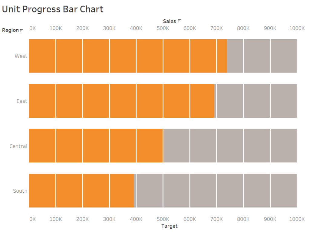
Once completed, your unit progress bar chart should display the progress toward sales goals by region. Adjust the design to align with your presentation needs, such as adding tooltips to highlight specific sales figures or annotating milestones directly on the chart.
Why Use Unit Progress Bar Charts?
These charts are perfect for visualizing:
- Regional sales performance toward a target.
- Progress tracking for KPIs across categories.
- Goal achievement over time or within specific business segments.
Incorporate this method into your Tableau dashboards to add an intuitive, visually appealing element that helps stakeholders quickly interpret performance. Happy visualizing!