
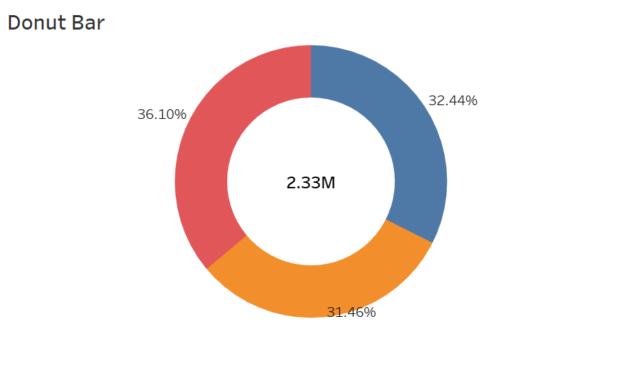
Donut charts are a variation of pie charts that are sleek, visually appealing, and effective for showing proportions or contributions of parts to a whole. The central hole in a donut chart creates space for additional information, such as a total value or key metric, which enhances the chart’s storytelling capability. In this blog post, I’ll guide you step-by-step on how to create a donut chart in Tableau, referencing the best practices from trusted sources.
Why Use a Donut Chart?
Donut charts are an excellent choice when you want to:
- Show proportions between categories.
- Add clarity by displaying an overall total or key insight in the center.
- Enhance the visual appeal of your dashboard with modern design.
Now let’s dive into creating a donut chart in Tableau!
Step 1: Connect to Your Dataset
For this tutorial, we’ll use Tableau’s Sample – Superstore dataset. You can replicate these steps with your own data.
- Open Tableau and connect to the Sample – Superstore dataset.
- Navigate to a new worksheet.
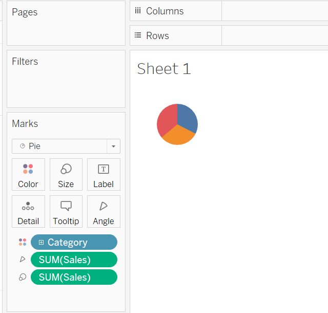
Step 2: Build the Basic Pie Chart
- Drag a dimension to the Rows shelf (e.g., Category).
- Drag a measure to the Columns shelf (e.g., Sales).
- On the Marks card, change the chart type to Pie.
- Drag the dimension (e.g., Category) to the Color shelf on the Marks card.
- Drag the measure (e.g., Sales) to the Angle shelf to define the size of each slice.
- Or you can simply click the “Show Me” card and select pie chart at right top corner once you have all the fields in the canvas, Tableau will automatically make a pie for you.
At this point, you have a basic pie chart.
Step 3: Create the Donut Chart
To transform the pie chart into a donut chart, we’ll create a hole in the middle by layering a second, empty circle.
Create the Hollow Part
- Create 1 dummy fields in the column by typing in ‘avg(0.0)’ and duplicating it.
- Remove any fields from the second pie chart marks to create the inner section.
- Change color to White
- Reduce the size of the Pie.

Add a Dual Axis
- For Right-click the second axis and select Dual Axis.
- Synchronize the axes by right-clicking one of the axes and selecting Synchronize Axis.
- Now you will see a “hole” in the middle of your donut chart.

Step 4: Format and Style the Chart
- Colors:
- Use a color palette that aligns with your dashboard theme or corporate branding.
- Assign distinct colors to each category for clarity.
- Borders and Lines:
- Go to Format > Borders and remove unnecessary gridlines or borders to clean up the view.
- Labels:
- Add labels to show the percentage or value of each slice by dragging Sales onto the Label shelf for the pie chart.
- Adjust the font size and placement for better readability.
- Uncheck show headers to remove header
- Title:
- Add a descriptive title to the chart, such as “Sales Distribution by Category”.

When to Use Donut Charts?
- To visualize proportions between categories (e.g., sales by product category).
- To highlight a key metric in the center.
- When you want a modern, visually clean alternative to pie charts.
Conclusion
Creating a donut chart in Tableau is straightforward and adds a polished, professional look to your visualizations. By following these steps, you can build a donut chart that not only communicates proportions effectively but also provides additional insights by utilizing the center space.
Experiment with different data points, colors, and formatting options to make the donut chart fit seamlessly into your dashboards. Happy visualizing!