
Polar charts are a unique and visually compelling way to display data in a circular format. In this tutorial, we’ll guide you through creating a polar chart in Tableau using the Sample Superstore dataset. Whether you’re using Tableau Desktop or Tableau Public, follow these steps to build a stunning visualization.
Step 1: Load the Sample Data
- Open Tableau Desktop or Tableau Public.
- If using Tableau Desktop, connect to the built-in Sample – Superstore data source.
- If you’re using Tableau Public, download and load the Orders Data Source.
Step 2: Create Bins and Calculated Fields
With the dataset loaded, create the following bins and calculated fields to set up the foundation for the polar chart.
1. Path
Create a calculated field named Path:
IIF([Ship Mode] = "First Class", 1, 102)
2. Path (bin)
- Right-click on the Path field, go to Create, and select Bins.
- In the Edit Bins window:
- Set the New field name to Path (bin).
- Set the Size of bins to 1.
- Click OK.
3. Index
Create a calculated field named Index:
INDEX() - 2
4. Index (Segment)
Create another calculated field named Index (Segment):
INDEX() - 1
5. TC_Date Part
WINDOW_MAX(MAX(DATEPART("month", [Order Date])))
6. TC_Sales
WINDOW_SUM(SUM([Sales]))
7. TC_Total Sales
WINDOW_SUM(SUM([Sales]))
8. TC_Percentage
[TC_Sales] / [TC_Total Sales]
9. TC_Percentage (Adjusted)
[TC_Percentage] / WINDOW_MAX([TC_Percentage])
10. TC_Step Size
code3.6 / 12
11. TC_Starting Point
([TC_Date Part] - 1) * 360 / 12
12. X
IF [Index] = -1 THEN
    0
ELSE
    SIN(RADIANS([Index] * [TC_Step Size] + [TC_Starting Point])) * [TC_Percentage (Adjusted)]
END
13. Y
IF [Index] = -1 THEN
    0
ELSE
    COS(RADIANS([Index] * [TC_Step Size] + [TC_Starting Point])) * [TC_Percentage (Adjusted)]
END
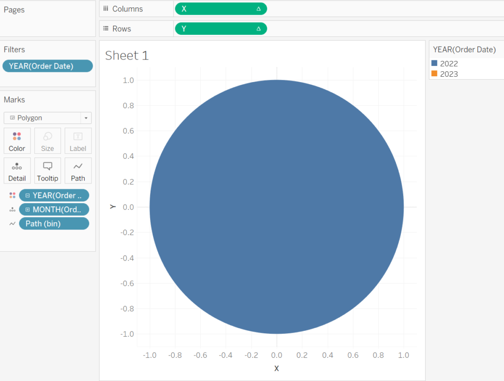
Step 3: Build the Worksheet
- Change the Mark Type
- Set the Mark Type to Polygon.
- Filter the Data
- Drag Order Date to the Filters shelf and filter for the years 2022 and 2023.
- Add Color and Detail
- Drag Order Date to the Color mark.
- Right-click on the pill and ensure it is set to Discrete Year.
- Drag Order Date to the Detail mark, setting it to Discrete Month.
- Use the Path (bin)
- Drag Path (bin) to the Columns shelf.
- Right-click the pill and select Show Missing Values.
- Drag Path (bin) to the Path mark.
- Set X and Y Axes
- Drag X to the Columns shelf.
- Right-click the pill, go to Compute Using, and select Path (bin).
- Drag Y to the Rows shelf.
- Right-click the pill, go to Compute Using, and select Path (bin).
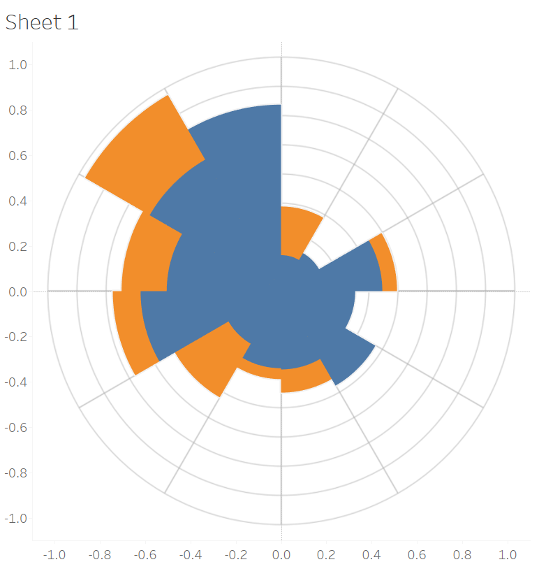
If all goes well, this is what you should be seeing:
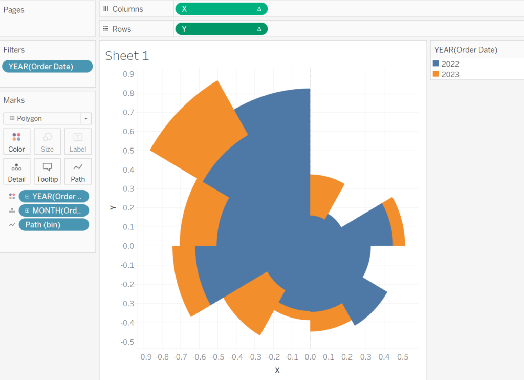
Step 4: Adjust Table Calculations
- Edit X Table Calculation
- Right-click on X in the Columns shelf and select Edit Table Calculation.
- In Nested Calculations, select TC_Percentage (Adjusted).
- Under Compute Using, choose Specific Dimensions and check:
- Path (bin)
- Month of Order Date
- Year of Order Date
Ensure Path (bin) is at the top and Year of Order Date is at the bottom.
- Repeat for TC_Total Sales under the same settings.
- Edit Y Table Calculation
- Right-click on Y in the Rows shelf and follow the same steps as for X.
If everything is configured correctly, your visualization should now appear as a circular polar chart.
Step 5: Add Background Image
Enhance the polar chart with a background image:
- Download the Image: Use a relevant image or download one specifically for polar charts. You can download one from here.
- Add the Image:
- Go to the Tableau Menu and navigate to Map > Background Images > Orders….
- Click Add Image… and select the downloaded file under File or URL.
- Configure the Image:
- Set X Field to X and adjust Left to
-1.1and Right to1.1. - Set Y Field to Y and adjust Left to
-1.1and Right to1.1. - Click OK.
- Set X Field to X and adjust Left to
- Fix Axis Ranges:
- Double-click the X-Axis Header and set the range from
-1.1to1.1. - Double-click the Y-Axis Header and set the range from
-1.1to1.1.
- Double-click the X-Axis Header and set the range from
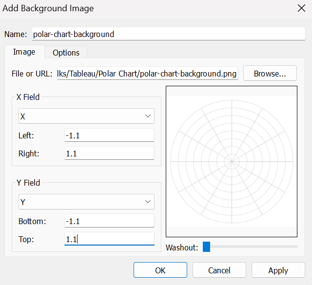
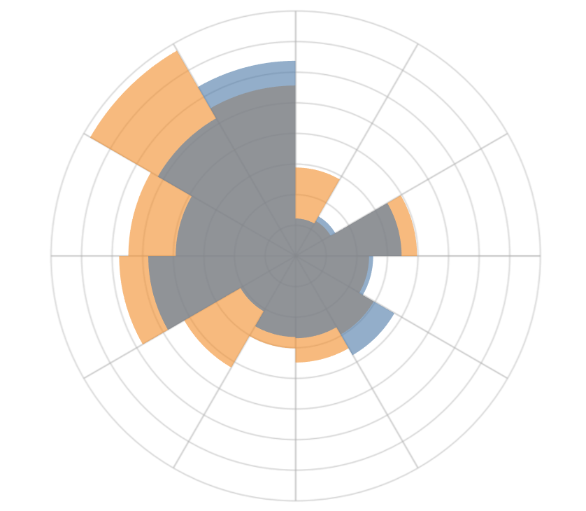
This is what you should see now, pretty slick, isn’t it?
Final Step: Refine the Visualization
To complete and polish your polar chart, follow these cosmetic adjustments:
- Hide Grid Lines.
- Hide Zero Lines.
- Remove Row Dividers and Column Dividers.
- Hide the X-Axis and Y-Axis Headers for a cleaner look.
- Adjust the Color Opacity to 60% for better visual balance.(You can choose to change border color to give a clear seperation)
- Customize the Tooltips to display relevant information.
With these refinements, your visualization will be ready and should look like this:
While polar charts are visually striking and can add flair to your dashboards, they are not always the most effective choice for data analysis. Their circular format can make precise comparisons difficult, especially for smaller differences. Before using a polar chart, carefully consider your use case to ensure it aligns with your visualization goals.
At the same time, polar charts are a great way to present cyclical data in an engaging and innovative format. By following these steps, you can create your own polar chart in Tableau using the Sample Superstore dataset. Experiment with colors, labels, and formatting to make the visualization align with your storytelling goals.