When working with Power BI line charts, you may want to display two data series with different scales using dual Y-axes (primary and secondary Y-axis). However, if the scales don’t match, it can make your chart confusing and potentially misleading. To ensure your data is accurately represented, synchronizing the Y-axes by setting consistent minimum and maximum values is key. This guide will walk you through the steps to synchronize the primary and secondary Y-axes specifically for Power BI line charts.
Why Synchronize Y-Axes in Line Charts?
Dual Y-axes are often used in line charts to compare two datasets with different units or scales (for example, comparing sales revenue in dollars to profit percentage). If the primary and secondary Y-axes are not synchronized, each dataset will scale independently, which can distort trends and make it difficult for viewers to interpret the relationship between the two lines accurately. Synchronizing the Y-axes aligns them to a common scale, improving readability and comparison.
Step-by-Step Guide to Synchronizing Y-Axes in Power BI Line Charts
To synchronize the Y-axes in a line chart, we’ll identify the minimum and maximum values across both datasets and apply these values consistently to both the primary and secondary Y-axes.
Step 1: Identify the Minimum and Maximum Values Across Both Datasets
Start by calculating the minimum and maximum values across the two datasets you want to display in the line chart.
- For example: If Dataset A (displayed on the primary Y-axis) ranges from 10 to 100, and Dataset B (displayed on the secondary Y-axis) ranges from 5 to 120:
- Min Value: The lowest value between both datasets is 5.
- Max Value: The highest value between both datasets is 120.
The formulas to get the min value and max values are:
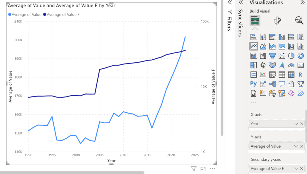
Min Value = MINX('Table A','Table A'[Value])Max Value = MAXX('Table B','Table B'[Value])Take this visual I have, when we just drag values from both dataset to a line chart, the Y-axes are way off.

Step 2: Apply Conditional Formatting to Y-Axes Using Dynamic Min and Max
Power BI allows conditional formatting to be applied to chart properties, including Y-axis settings. Use this feature to set the dynamically calculated min and max values on both Y-axes.
- Select the Line Chart: Click on your line chart visual to make sure it’s active.
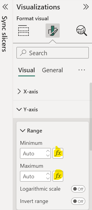
- Open the Format Pane: In the Visualizations pane, click on the Format button (paint roller icon).
- Apply Conditional Formatting to Primary Y-Axis:
- Expand the Y-Axis section.
- In the Minimum field, click the fx (conditional formatting) button.
- Select Field Value and choose your
Min_Valuemeasure. - Repeat this for the Maximum field by selecting the
Max_Valuemeasure.
- Apply Conditional Formatting to Secondary Y-Axis:
- Expand the Secondary Y-Axis section.
- Repeat the same process by setting the Minimum and Maximum fields using the
Min_ValueandMax_Valuemeasures.

Now, both the primary and secondary Y-axes will be dynamically aligned based on the min and max values across both datasets. The Y-axis scales will automatically update as your data changes, maintaining synchronization without manual adjustments.
Step 3: Adjust Display Units (Optional)
Depending on the range of values, you may want to adjust the display units to make the chart cleaner.
- In the Format pane, under both Y-Axis and Secondary Y-Axis sections, look for the Display Units option and select a unit that fits the data range (e.g., Thousands, Millions).
Step 4: Add Data Labels for Clearer Comparison (Optional)
To enhance readability, you may also consider adding data labels to each line, especially if they represent distinct metrics.
- In the Format pane, find the Data Labels option.
- Toggle it on and adjust the settings as needed to display values alongside each line.
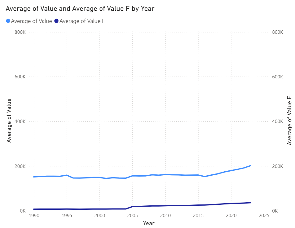
With Y-axis synchronized, I have this visual reshaped and represent my datasets more accurately.

Benefits of Synchronizing Y-Axes in Line Charts
- Improved Comparability: Aligning the scales makes it easy to interpret relationships and trends between datasets.
- Enhanced Clarity: Synchronized Y-axes provide a clean, professional look and prevent viewers from misinterpreting the data.
- Accurate Representation: Consistent scales ensure that differences in trends are visually meaningful.
Conclusion
Synchronizing the primary and secondary Y-axes in Power BI line charts is an effective way to present data clearly, especially when comparing two datasets with different ranges. By setting the min and max values consistently across both axes, you can ensure that your line chart provides a clear, accurate, and easy-to-understand visual representation.
Next time you use dual Y-axes in a line chart, follow this approach to improve readability and make your Power BI reports more impactful.
Discover more from Daily BI Talks
Subscribe to get the latest posts sent to your email.

