
In data visualization, the right design can make your insights not just clearer but also more engaging. Rounded bar charts and bar-in-bar charts are two excellent options for adding polish and depth to your dashboards. These chart types bring a modern touch to traditional visuals while enhancing storytelling and usability. In this blog post, we’ll use Tableau’s Superstore dataset to create these charts and discuss their applications.
Part 1: Crafting a Rounded Bar Chart
Rounded bar charts stand out by softening the harsh edges of regular bars, giving the visualization a sleek, modern aesthetic. Follow these steps to create one(Very similar to how to create a lollipop bar we discussed before):
Step 1: Start with a Bar Chart
- Open Tableau and connect to the Sample – Superstore dataset.
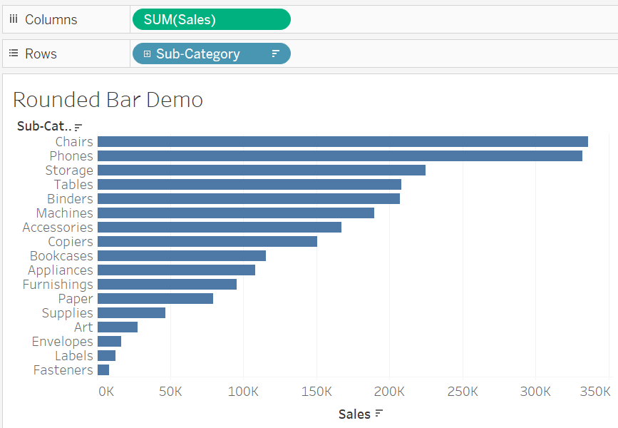
- Drag Sub-Category to the Rows shelf.
- Drag Sales to the Columns shelf to create a standard bar chart.
- Sort the chart by descending sales using the sort icon on the axis.
Step 2: Duplicate the Axis
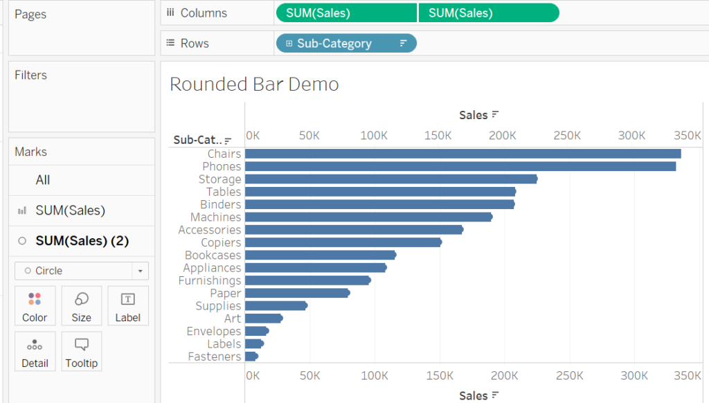
- Drag Sales to the Columns shelf again to duplicate the measure.
- Right-click the second SUM(Sales) axis and select Dual Axis.
- Synchronize the axes by right-clicking the secondary axis and choosing Synchronize Axis.
Step 3: Change Mark Types
- On the Marks card:
- Set the first SUM(Sales) mark type to Bar.
- Set the second SUM(Sales) mark type to Circle.
Step 4: Perfect the Design
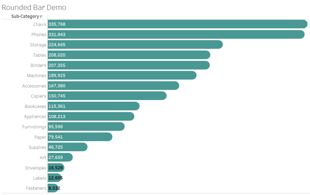
- Adjust the Size of the bars and circles:
- Narrow the bars slightly for a clean look.
- Increase the circle size to match the bar width, creating a seamless transition between the two marks.
- Apply consistent colors:
- Use the same color for both the bars and circles to maintain a uniform design.
- For emphasis, consider applying gradients or subtle shading.
- Hide unnecessary elements:
- Right-click and hide gridlines, headers, and borders to declutter the chart.
Step 5: Add Labels and Context
- Drag Sales to the Label shelf for the circle mark to show sales values at the endpoints.
- Add a dynamic title, such as “Sales by Category with Rounded Bars,” to provide context.
Part 2: Building a Bar-in-Bar Chart
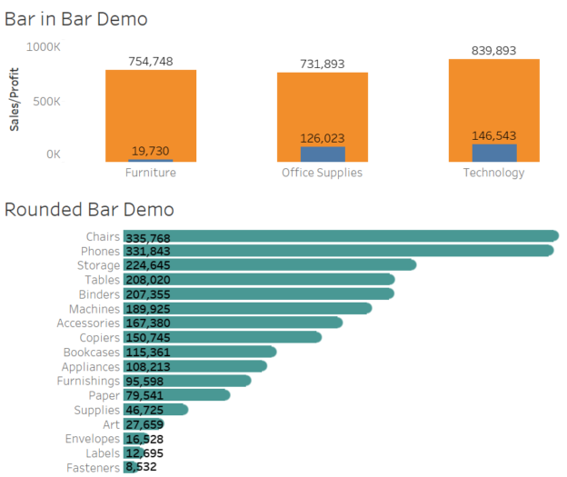
Bar-in-bar charts are a practical way to compare two measures side by side, such as sales vs. profit or actual vs. target. This dual-layered chart helps users quickly spot differences and trends.
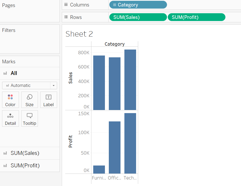
Step 1: Create the Base Chart
- Drag Category to the Columns shelf.
- Drag Sales to the Rows shelf to build the first layer.
- Drag another measure, such as Profit, to the Rows shelf to add the second layer.
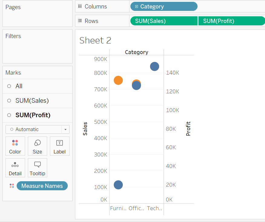
Step 2: Combine the Bars
- Right-click the secondary axis (Profit) and select Dual Axis.
- Synchronize the axes to ensure consistency.
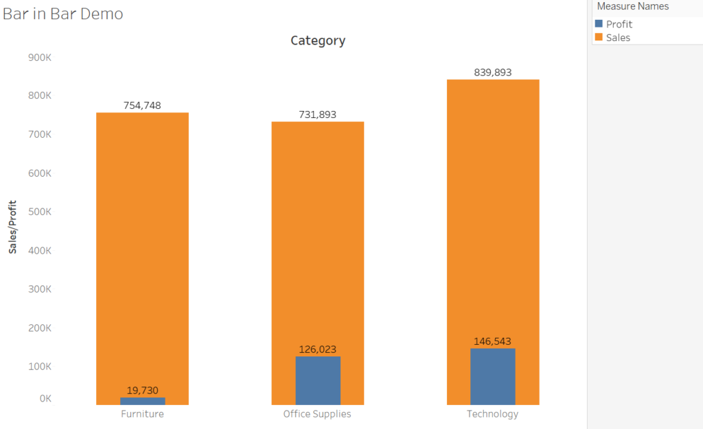
Step 3: Adjust Mark Types and Sizes
- On the Marks card:
- Set the SUM(Sales) mark type to Bar.
- Set the SUM(Profit) mark type to Bar as well.
- Reduce the size of the Profit bars to make them narrower than the Sales bars.
Step 4: Customize Colors and Labels
- Use contrasting colors to differentiate the measures:
- Assign a bold color (e.g., blue) to Sales and a lighter shade (e.g., light blue) to Profit.
- Add labels to both layers:
- Drag Sales to the Label shelf for the wider bars.
- Drag Profit to the Label shelf for the thinner bars.

Step 5: Format and Enhance the Chart
- Use tooltips to provide detailed comparisons, such as percentage differences or ratios.
- Add annotations for outliers or significant insights.
- Title the chart with something descriptive.
Advanced Customizations for a Professional Look
- Add Interactivity:
- Use filters or parameters to allow users to switch between dimensions (e.g., region or sub-category) or measures (e.g., sales vs. profit vs. target).
- Use Color Gradients:
- Highlight performance thresholds by applying color gradients to the bars. For example, darker shades for higher sales or profits.
- Combine with Other Charts:
- Pair the bar-in-bar chart with a trendline or scatterplot for additional context.
When to Use These Charts
- Rounded Bar Charts:
- For dashboards where aesthetics are crucial, such as executive presentations or customer-facing reports.
- Ideal for displaying clean, high-level overviews of single metrics.
- Bar-in-Bar Charts:
- When comparing actual vs. target metrics, such as sales vs. goals.
- Useful for highlighting gaps, trends, and areas of underperformance or overachievement.
Rounded bar charts and bar-in-bar charts aren’t just visually appealing—they’re functional and intuitive. By following these steps, you can create elegant and effective visualizations in Tableau using the Superstore dataset.
Experiment with these chart types in your next dashboard to make your data storytelling more impactful and engaging. Remember, great design isn’t just about looking good—it’s about making insights accessible and actionable. Happy visualizing!
Discover more from Daily BI Talks
Subscribe to get the latest posts sent to your email.