
Hex maps or Tile grip maps are a visually appealing alternative to traditional geographic maps. They arrange regions or states into a grid of hexagons, standardizing their size and shape while maintaining their relative positioning. This approach eliminates distortion caused by geographic size differences and focuses on comparative analysis.
In this blog, I’ll guide you through the process of creating a hex map in Tableau using the Superstore dataset without data blending, based on a method that utilizes custom coordinates.
Why Use a Hex Map?
Hex maps are ideal for:
- Standardizing Visuals: Equalizing the size of states or regions to avoid misinterpretation.
- Simplifying Analysis: Highlighting patterns without geographic bias.
- Space Efficiency: Presenting compact visuals for dashboards.
Step 1: Prepare Your Dataset
To create a hex map, you’ll need a dataset containing hexagon coordinates for each state. While Tableau doesn’t natively provide this, you can generate or download such a dataset (e.g., from online resources).
The hex map dataset should include:
- State: The state names or abbreviations.
- X Coordinate(Column): The horizontal position of the hexagon.
- Y Coordinate(Row): The vertical position of the hexagon.
You can download a file created by Matt Chambers here.
Step 2: Load the Custom Hex Map Shape
Hex maps often use hexagonal shapes to create a cohesive design. To load a custom hex shape into Tableau, follow these steps:
- Obtain a Hexagon Shape File:
- Download or create a hexagon-shaped
.pngor.svgfile. Ensure it’s a simple shape with a transparent background.
- Download or create a hexagon-shaped
- Save the Shape File:
- Save the hexagon shape file in Tableau’s Shapes folder, typically located at:plaintextCopy code
Documents > My Tableau Repository > Shapes - Create a new folder (e.g., Hex Map Shapes) inside the Shapes directory and place the hexagon file in it.
- Save the hexagon shape file in Tableau’s Shapes folder, typically located at:plaintextCopy code
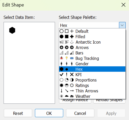
- Refresh Shapes in Tableau:
- Open Tableau and go to the Marks card.
- Change the Mark Type to Shape.
- Click the Shape dropdown and select More Shapes.
- Locate your custom folder (Hex Map Shapes) and select the hexagon shape.
- Apply the Shape to the Map:
- Drag the State field to the Detail shelf in the Marks card.
- Tableau will replace each data point with your custom hex shape.
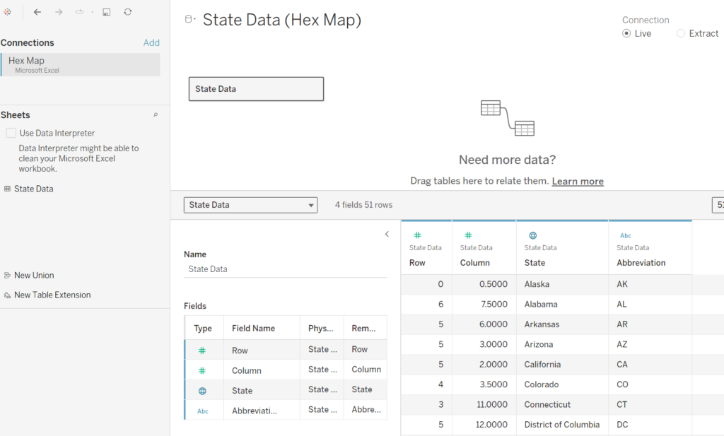
Step 3: Combine the Hex Map Dataset with Superstore Data
- Connect to Your Data:
- Open Tableau and connect to the Sample – Superstore dataset.
- Add the hex map dataset as a secondary data source.
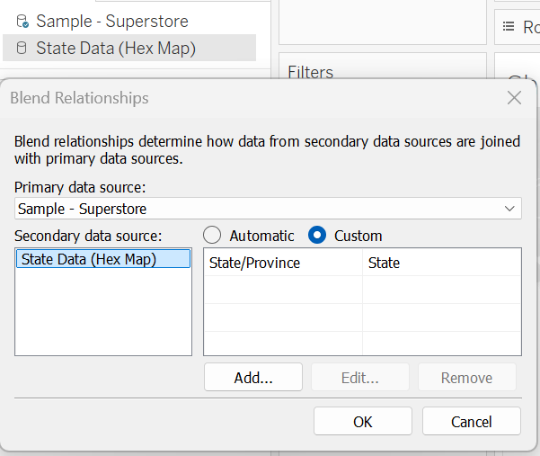
- Join the Data Sources:
- Use the State field as the common key between Superstore and the hex map dataset.
- Ensure the join relationship is based on the State dimension.
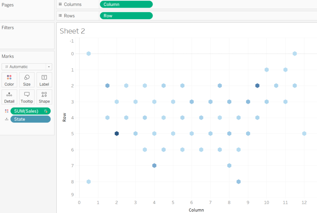
Step 4: Build the Hex Map
- Assign Hexagon Positions:
- Drag the X Coordinate field to the Columns shelf, change it to a continuous dimension.
- Drag the Y Coordinate field to the Rows shelf, change it to a continuous dimension, and edit the axis for Rows and reverse the scale.
- Map Each State to a Hexagon:
- Drag State to the Detail shelf in the Marks card.
- Tableau will plot each state as a hexagon based on its X and Y coordinates.
- Add Data to the Map:
- Drag a measure (e.g., Sales or Profit) to the Color shelf.
- Tableau will color each hexagon based on the selected measure, creating a heatmap effect.
Step 5: Format the Hex Map
- Adjust Hexagon Sizes:
- On the Marks card, use the Size slider to ensure the hexagons fit together seamlessly.
- Remove Gridlines:
- Go to Format > Lines and set all gridlines and borders to None for a clean look.
- Add Labels:
- Drag State or Abbreviation to the Label shelf if you want to display state names within the hexagons.
- Customize Colors:
- Use diverging or sequential color palettes to highlight differences in measures. For example, green for high sales and red for low sales.
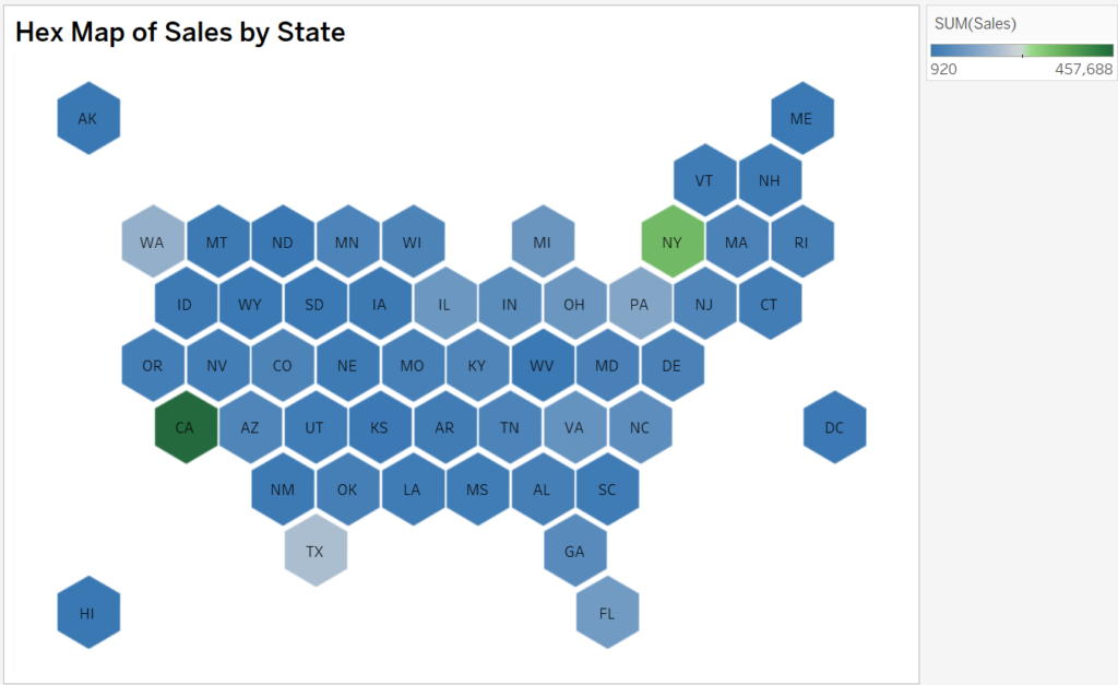
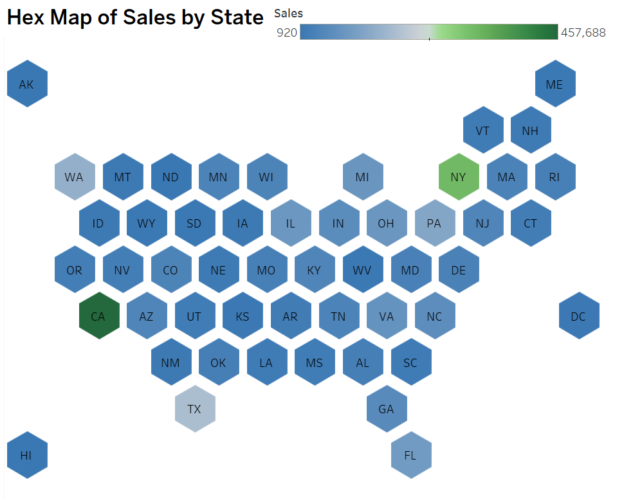
Step 6: Final Touches
- Add a Title and Legend:
- Add a chart title such as “Hex Map of Sales by State” to provide context.
- Include a color legend to explain the gradient or color scale.
- Test Interactivity:
- Add tooltips to display detailed data when hovering over a hexagon. For example, include state name, sales, and profit.
- Fit to Dashboard:
- Resize and align the hex map within a dashboard layout for optimal presentation.
Applications of Hex Maps
Hex maps are excellent for:
- Comparing state-wise metrics like sales, profit, or population.
- Highlighting trends or patterns that might get lost in traditional maps.
- Simplifying presentations where geographic size variations can skew interpretations.
Hex maps offer a unique way to visualize geographic data without the distortion of traditional maps. By following this guide, including loading custom hex shapes, you can create compelling and insightful visualizations in Tableau.
Start experimenting with hex maps in your dashboards to communicate data more effectively and engage your audience. Happy visualizing!
Inspired by Zen Master Matt Chambers – Hex Tile Maps in Tableau
Discover more from Daily BI Talks
Subscribe to get the latest posts sent to your email.