
Tilted bar charts, with their unique slanted orientation, offer a fresh perspective for visualizing comparative data. These charts can help your dashboards stand out while providing insightful visual analysis. In this tutorial, we’ll guide you through creating a tilted bar chart in Tableau using the Sample Superstore dataset.
Step 1: Load and Prepare the Data
Load the Dataset
- Open Tableau Desktop or Tableau Public.
- If you’re using Tableau Desktop, connect to the Sample – Superstore data source.
- If you’re using Tableau Public, download and load the dataset.
Add Path Data
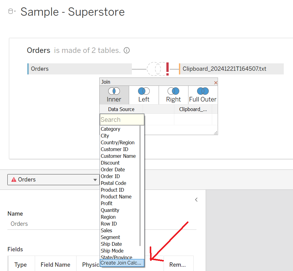
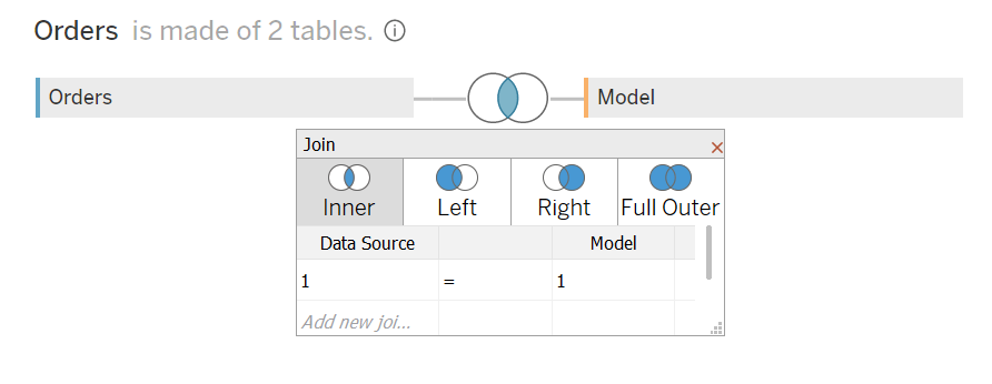
- Right-click the data source and select Edit Data Source.
- In the Data Source Editor, open the relationship model, paste the following Path
Path
1
4- You may get an error as there is no joining column, so we need to create one:
- Click Add New Join Clause, select Create Join Calculation, type
1, and click OK. - Repeat this for the right-hand side of the join.
- Click Add New Join Clause, select Create Join Calculation, type
- Ensure that the join type is set to Inner Join.
Step 2: Create Bins, Parameters, and Calculated Fields
With our data set loaded into Tableau, we are going to create the following Bins, Parameters and Calculated Fields:
Path (bin)
- Right-click the Path field, select Create, and then choose Bins.
- In the Edit Bins window:
- Set New Field Name to Path (bin).
- Set Size of Bins to 1.
- Click OK.
Parameters
Create the following parameters to add interactivity to your chart:
- @Bar Height
- Data Type: Float
- Allowable Values: Range
- Minimum: 0.1
- Maximum: 1.5
- Step Size: 0.1
- Current Value: 1.2
- @Degrees
- Data Type: Integer
- Allowable Values: Range
- Minimum: -80
- Maximum: 80
- Step Size: 10
- Current Value: 0
- @Top X
- Data Type: Integer
- Allowable Values: Range
- Minimum: 1
- Maximum: 50
- Step Size: 1
- Current Value: 10
- @Dimension
- Data Type: String
- Allowable Values: List
- Values: Category, Sub-Category, State, Region
- Current Value: State
Calculated Fields
Create the following calculated fields:
- Index (Path)
INDEX()
- Index (Dimension)
INDEX()
- Dimension
IF [@Dimension] = "Category" THEN [Category] ELSEIF [@Dimension] = "Sub-Category" THEN [Sub-Category] ELSEIF [@Dimension] = "State" THEN [State] ELSEIF [@Dimension] = "Region" THEN [Region] END
- TC_Sales
WINDOW_SUM(SUM([Sales])) / 2
- TC_Max Sales
WINDOW_MAX(SUM([Sales])) / 2
- TC_Sales (Adjusted)
[TC_Sales] / [TC_Max Sales]
- Y-Adjustment (Tilt Value)
TAN(RADIANS([@Degrees])) * [TC_Sales (Adjusted)]
- X
IF [Index (Path)] = 1 OR [Index (Path)] = 4 THEN 0 ELSE [TC_Sales (Adjusted)] END
- Y
IF [Index (Path)] = 1 THEN 0 + [Index (Dimension)] ELSEIF [Index (Path)] = 2 THEN 0 + [Index (Dimension)] - [Y-Adjustment (Tilt Value)] ELSEIF [Index (Path)] = 3 THEN [@Bar Height] + [Index (Dimension)] - [Y-Adjustment (Tilt Value)] ELSEIF [Index (Path)] = 4 THEN [@Bar Height] + [Index (Dimension)] END
- Label Position
INDEX() + ([@Bar Height] / 2)
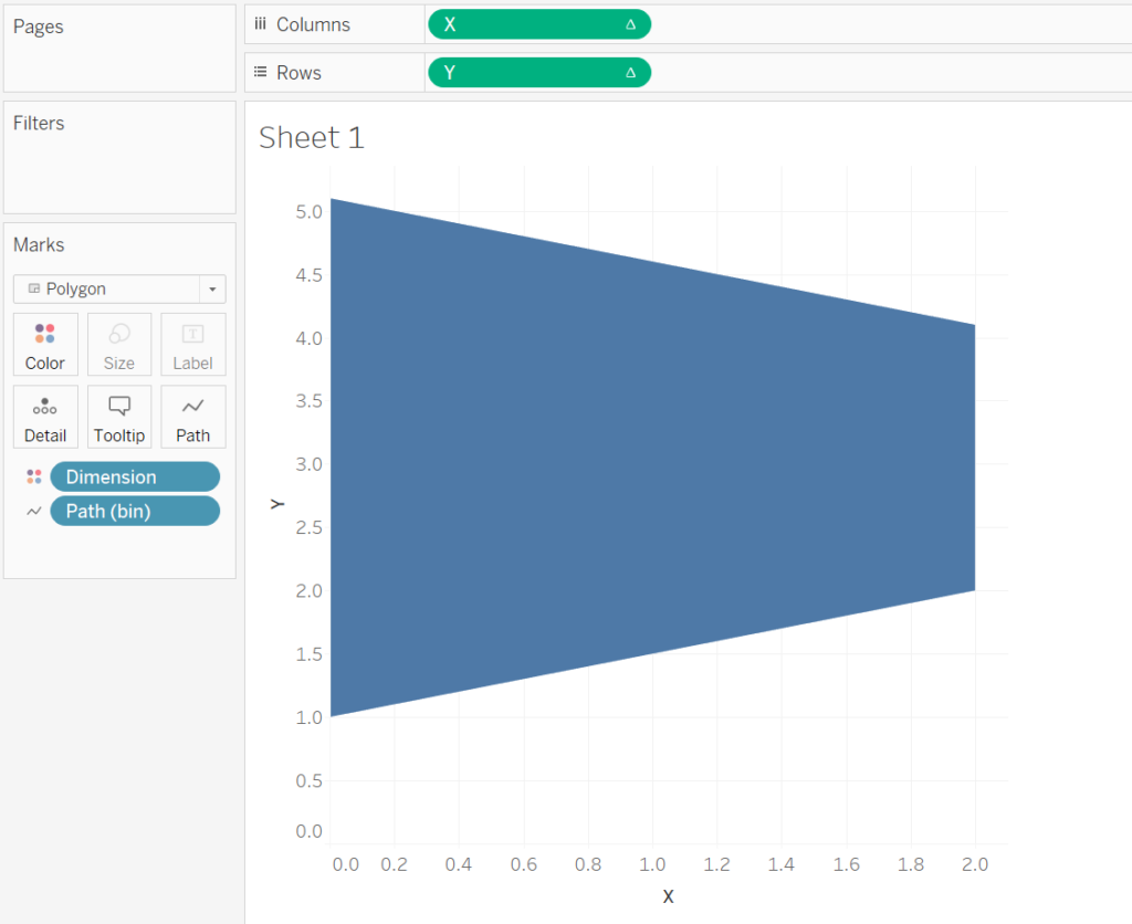
Step 3: Build the Tilted Bar Chart
- Set the Mark Type
- Change the Mark Type to Polygon.
- Add Dimension and Color
- Drag Dimension to the Color mark.
- Use Path (bin)
- Drag Path (bin) to the Rows shelf.
- Right-click the pill and ensure Show Missing Values is selected.
- Drag Path (bin) to the Path mark.
- Set X and Y Axes
- Drag X to the Columns shelf.
- Right-click the pill, select Compute Using, and choose Path (bin).
- Drag Y to the Rows shelf.
- Right-click the pill, select Compute Using, and choose Path (bin).
- Drag X to the Columns shelf.
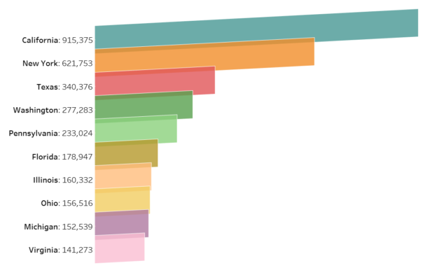
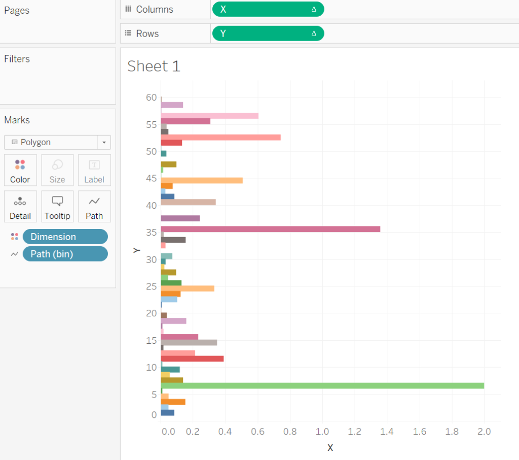
If you follow the exact steps illustrated, you should see a chart like this:
Step 4: Adjust Table Calculations
To ensure the chart behaves as expected, we need to fine-tune the table calculations for X and Y.
- Adjust X Table Calculation
- Right-click on the X pill in the Columns shelf and select Edit Table Calculation.
- In the Nested Calculations dropdown, select TC_Max Sales.
- Under Compute Using, choose Specific Dimensions and ensure the following are selected:
- Path (bin) (at the top of the list).
- Dimension.
- Adjust Y Table Calculation
- Right-click on the Y pill in the Rows shelf and select Edit Table Calculation.
- In the Nested Calculations dropdown, select Index (Dimension).
- Under Compute Using, choose Specific Dimensions and ensure that only Dimension is selected.
- Next, in Nested Calculations, select TC_Max Sales.
- Under Compute Using, choose Specific Dimensions and ensure the following are selected:
- Path (bin) (at the top of the list).
- Dimension.
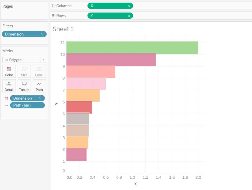
At this stage, your tilted bar chart structure should now resemble the intended design.
Step 5: Refine the Visualization
Filter and Sort the Data
- Drag Dimension onto the Filters shelf.
- Filter by Top using the @Top X parameter based on the Sum of Sales.
- Right-click on Dimension in the Color mark and select Sort.
- Configure the sorting:
- Sort by: Field.
- Sort Order: Ascending.
- Field Name: Sales.
- Aggregation: Sum.
Adjust Colors and Borders
- Click on the Color mark.
- Set the Opacity to 80%.
- Set the Border color to White for a polished look.
Step 6: Add Labels to the Chart
- Drag Label Position onto the Rows shelf.
- Right-click on the Label Position pill and go to Compute Using, then select Dimension.
- Right-click on the Label Position pill and select Dual Axis.
- Right-click on the Axis Header and select Synchronize Axis.
Customize the Label Marks
- In the Label Position Marks Shelf, change the Mark Type to Circle.
- Remove any unnecessary items from this shelf.
- Drag Dimension onto the Color and Label marks for added context. Adjust Label alignment to your liking.
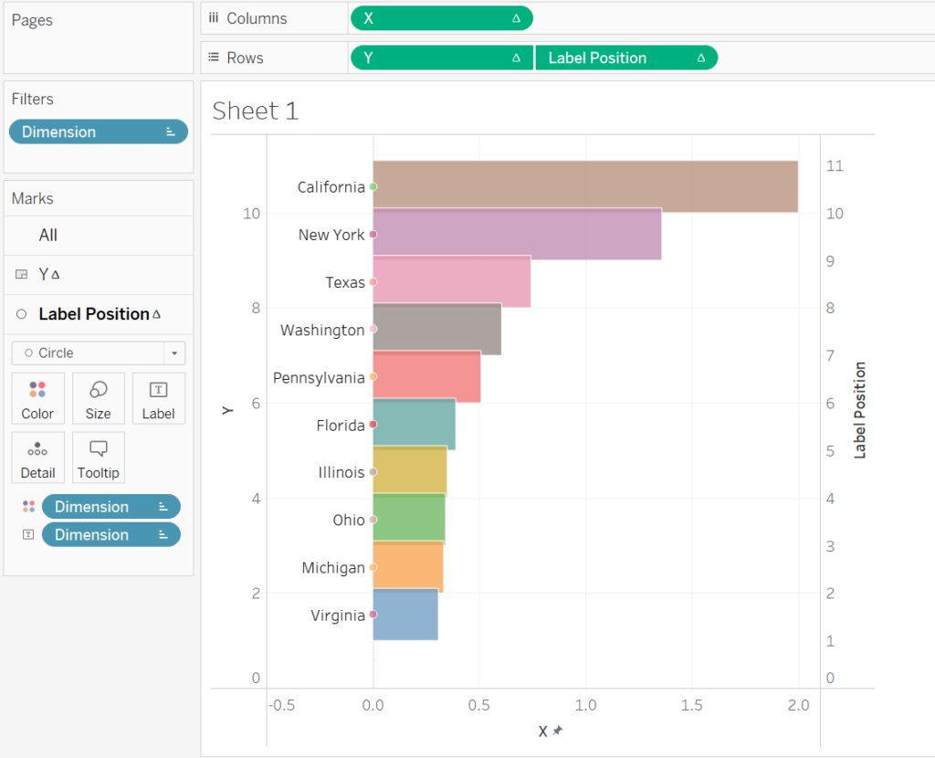
Something like this will finally show up.
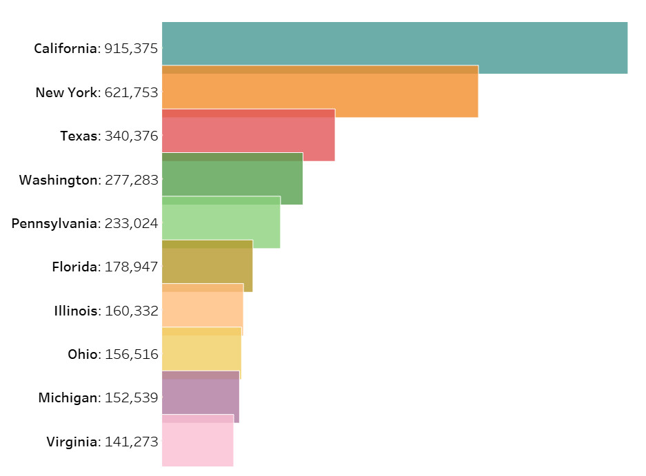
Step 7: Apply Final Cosmetic Touches
To make your tilted bar chart visually polished and presentation-ready, apply the following final adjustments:
- Fix the X-Axis for Better Text Visibility
- Adjust the X-axis range or alignment so the text labels are not cut off and remain legible.
- Hide Axis Headers
- Right-click on the X-axis and Y-axis headers and select Hide to declutter the view.
- Remove Dividers and Grid Lines
- Go to the Format menu and select Borders.
- Under Row Dividers and Column Dividers, set Pane to None.
- Under Grid Lines, set them to None for a cleaner visualization.
- Enhance the Labels
- Add more information to the Label by dragging additional fields or calculated fields onto the Label mark.
- Format the label text to display clear, concise insights, such as values or percentages, and adjust the font size and color for better readability.
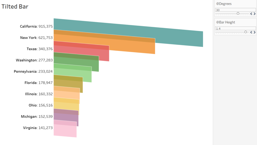
You can adjust the @Bar Height for the overlapping area and @Degree parameter for how much the bar to be tilted.
Tilted bar charts are not only visually unique but also interactive when paired with dynamic parameters. While they may not suit all analytical scenarios due to their unconventional format, they are perfect for adding creativity to dashboards when storytelling or design is a priority.
Make sure to balance aesthetics with clarity by considering your audience and use case. With this guide, you now have all the tools to create a beautiful tilted bar chart in Tableau.
Discover more from Daily BI Talks
Subscribe to get the latest posts sent to your email.