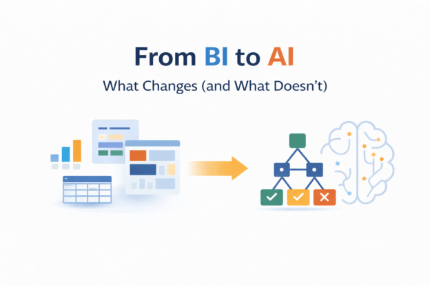
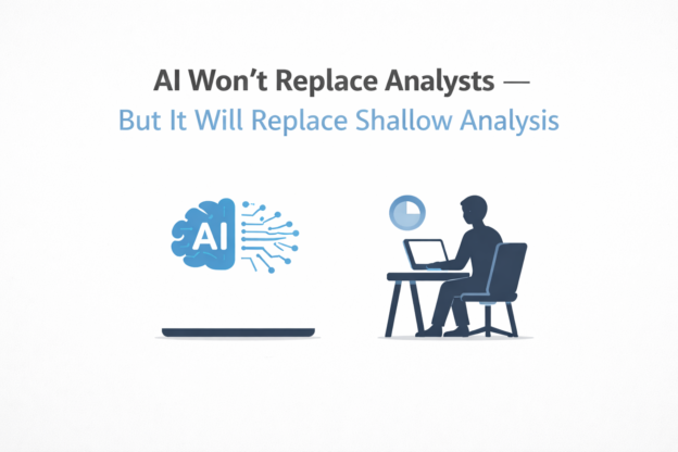
Author Archives: DailyBITalks

powerbi dax all allselected dailybitalks.com

Power BI Tips: How to use ALLSELECTED and ALL in DAX?

In a previous post about how to use Tableau Exclude LOD in Power BI, we briefly mentioned ALLSELECTED. However, ALLSELECTED is a more powerful and complex function than we covered at that time. In this article, we’ll delve deeper into not only ALLSELECTED but also its counterpart, ALL, to fully understand their capabilities and applications in Power BI.

Continue reading
How to Make Unit Progress Bar Chart in Tableau dailybitalks.com

How to Make Unit Progress Bar Chart in Tableau

Unit progress bar charts are a fantastic way to represent progress toward a goal, breaking the visualization into smaller units to highlight individual contributions. These charts are both visually appealing and effective for storytelling. In this post, we’ll guide you through the process of creating a unit progress bar chart in Tableau using the Superstore dataset.

Continue reading
WINDOWS FUNCTION dailybitalks.com

Advanced SQL: Windows Function Cheat Sheet

SQL window functions are one of the most powerful tools for performing calculations across a defined range of rows while maintaining access to individual row-level details. Unlike aggregate functions that collapse rows into a single value, window functions allow you to perform calculations over a subset of rows (a window) while preserving the original row structure.

Continue reading
How to Create Dumbbell Chart(Horizontally and Vertically) in Tableau dailybitalks.com

How to Create Dumbbell Chart(Horizontally and Vertically) in Tableau

Dumbbell charts are a fantastic visualization tool for comparing two data points across categories while emphasizing the difference between them. Often used to show progress or change over time, these charts highlight how values diverge or converge for each category. In this blog post, we’ll walk you through how to create a dumbbell chart in Tableau using the Superstore dataset.

Continue reading
How to Create Rounded Bar and Bar in Bar in Tableau dailybitalks.com

How to Create Rounded Bar and Bar in Bar in Tableau

In data visualization, the right design can make your insights not just clearer but also more engaging. Rounded bar charts and bar-in-bar charts are two excellent options for adding polish and depth to your dashboards. These chart types bring a modern touch to traditional visuals while enhancing storytelling and usability. In this blog post, we’ll use Tableau’s Superstore dataset to create these charts and discuss their applications.

Continue reading