If you’ve ever run an A/B test, you’ve probably seen this happen:
- The metrics bounce around every day
- It takes forever to reach significance
- Your A group is magically “different” from your B group
- Stakeholders keep asking, “Is this test done yet?”

If you’ve ever run an A/B test, you’ve probably seen this happen:
As a data analyst, you’re probably very comfortable working with SQL tables, CSV files, and Excel spreadsheets. But sooner or later, you’ll run into a situation like this:

If you work with data — in analytics, BI, or data engineering — you’ve probably heard the term dbt (pronounced “dee-bee-tee”). It has become one of the most popular tools in the modern data stack because it empowers analysts to build production-grade data pipelines using just SQL.
Continue reading
A/B testing (or split testing) is one of the most powerful tools in an analyst’s toolbox: it allows you to compare two (or more) versions of a web page, feature, or user experience — and determine which version truly performs better.
Continue reading
When building data-driven solutions — whether dashboards, reports, or analytical pipelines — you often focus on selecting, transforming, or visualizing data. But to make all that work, you need a well-structured database behind the scenes. That’s where Data Definition Language (DDL) comes in.
Continue reading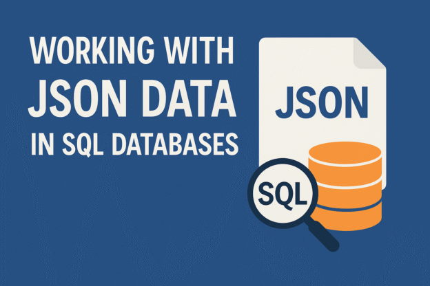
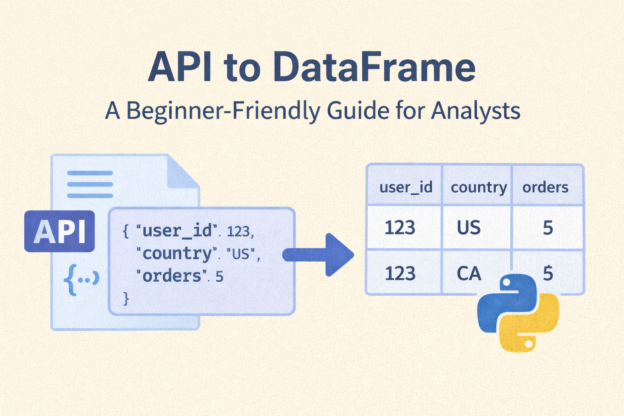
JSON (JavaScript Object Notation) has become the universal language for exchanging data between applications. Whether you’re pulling data from APIs, storing logs, or dealing with semi-structured data in a data lake — JSON is everywhere.
Continue reading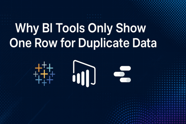
Have you ever imported a dataset into Tableau, Power BI, Looker Studio, or Qlik Sense—only to find that several identical rows suddenly appear as one?
If so, you’ve likely encountered BI tool data deduplication, a fundamental behavior across nearly all modern Business Intelligence platforms.
Continue reading
If you work with data long enough, you’ll eventually face the classic “Why does my number look weird?” problem.
Continue reading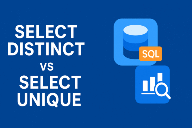
If you’ve worked with SQL for data analysis, you’ve probably used the SELECT DISTINCT keyword to remove duplicate rows. But at some point, you might come across another term — SELECT UNIQUE.
As data volumes continue to grow exponentially, traditional SQL engines often struggle to handle massive datasets efficiently. That’s where Apache Spark SQL comes in — a powerful module that combines the scalability of distributed computing with the simplicity of SQL syntax.
Continue reading