When analyzing sales performance, executives often ask:
“How are we performing so far this year compared to last year?”
That question can be answered easily if you know how to calculate Year-to-Date (YTD) values in Power BI.
Continue reading
When analyzing sales performance, executives often ask:
“How are we performing so far this year compared to last year?”
That question can be answered easily if you know how to calculate Year-to-Date (YTD) values in Power BI.
Continue reading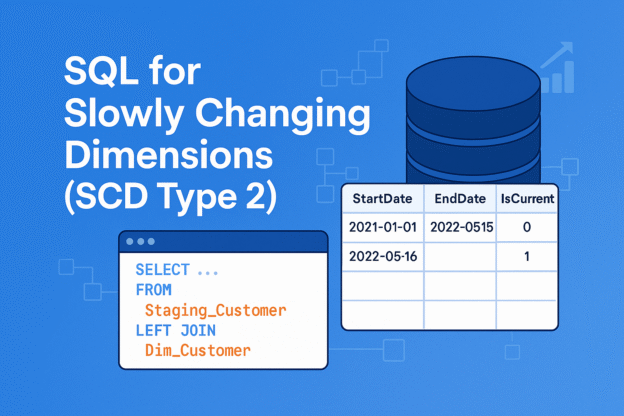
When building data warehouses, you’ll often face a classic challenge: how to track changes in dimension data over time. For example, what if a customer moves to a new city? Should you overwrite their old address or keep the historical record?
Continue reading
When working with databases, business analysts often come across two common objects: stored procedures and views. Both play a key role in querying and managing data, but they serve different purposes. Understanding their differences helps analysts write better queries, collaborate effectively with engineers, and choose the right tool for their reporting needs.
Continue reading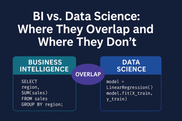
If you’ve worked with data at any level—business analyst, marketing manager, or even startup founder—you’ve probably heard the terms Business Intelligence (BI) and Data Science thrown around. Sometimes they seem interchangeable. Other times, people treat them like polar opposites.
Continue reading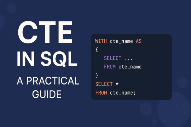
CTE (Common Table Expression) is a temporary result set defined within the execution scope of a single SELECT, INSERT, UPDATE, or DELETE statement.
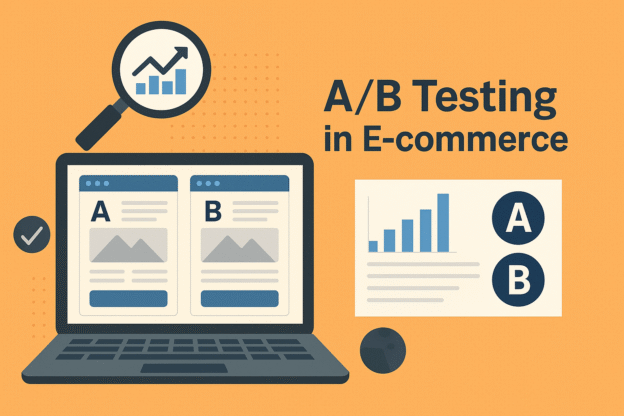
Imagine you launch a new checkout banner promising free shipping. It feels good, it looks good—but does it actually boost purchases?
Continue reading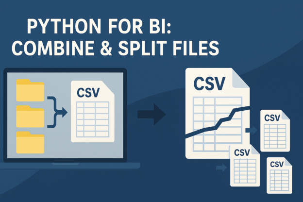
When you work in business intelligence, you inevitably deal with files—lots of them. Sometimes you’ll get a flood of daily CSV exports from your data warehouse. Other times, you’ll inherit a single monster file so large that Excel waves the white flag before it even opens.
Continue reading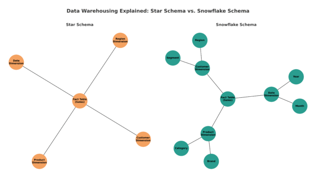
When you’re building a data warehouse, the way you model your data can make the difference between fast, intuitive analytics and a never-ending maze of joins. Two of the most common data modeling approaches are Star Schema and Snowflake Schema. Both serve the same purpose—structuring your data to support reporting and analysis—but they differ in design, performance, and usability.
Continue reading
If you’re learning data analysis with Python, mastering the pandas DataFrame is essential. A DataFrame is a powerful, table-like data structure that lets you load, explore, clean, and analyze data quickly.
Continue reading
In Business Intelligence (BI), SQL is used to extract and manipulate data from databases, while Python adds flexibility for data processing, visualization, and automation. Combining both enables you to build powerful, automated BI pipelines and dashboards.
Continue reading