
Data visualization is a powerful tool for conveying insights, but the effectiveness of a visualization largely depends on how well the chosen chart represents the underlying data. As a data analyst, selecting the appropriate chart type is critical to ensuring your message is communicated clearly and effectively. In this guide, we’ll explore the most common chart types, their strengths and weaknesses, and when to use each one.
Understanding the Importance of Chart Selection
The right chart can transform complex data into an easily digestible format, revealing trends, relationships, and patterns that may otherwise go unnoticed. The wrong chart, however, can obscure important insights, confuse your audience, or even mislead them. Therefore, it’s important to understand the characteristics of each chart type and how they align with your data’s purpose.
1. Bar and Column Charts: Comparing Categories
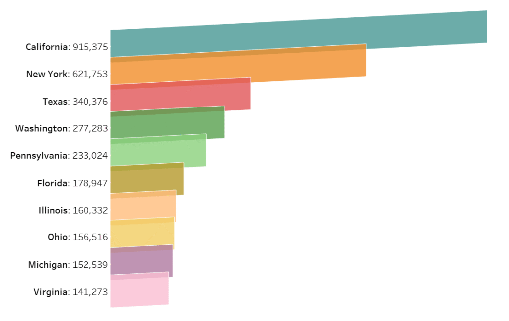
Interested in building a tilted bar chart like shown above? check out this post
Bar and column charts are among the most commonly used chart types in data analysis. Both of these charts help display comparisons between different categories or groups.
- When to Use:
These charts are ideal when you want to compare data across discrete categories. For example, you could use a bar chart to compare sales performance across different regions or customer satisfaction scores across various product categories. - Advantages:
- Simple to understand.
- Easy to compare values between categories.
- Can handle both small and large data sets effectively.
- Considerations:
- Horizontal bar charts are often better when category names are long.
- Vertical bar charts are more effective when dealing with time series data, as they allow for a natural comparison of trends over time.
Best Practices:
- Keep the axis labels clear and concise.
- Use consistent spacing between bars.
- Avoid using too many categories in one chart, as it can become cluttered.
2. Line Charts: Visualizing Trends Over Time
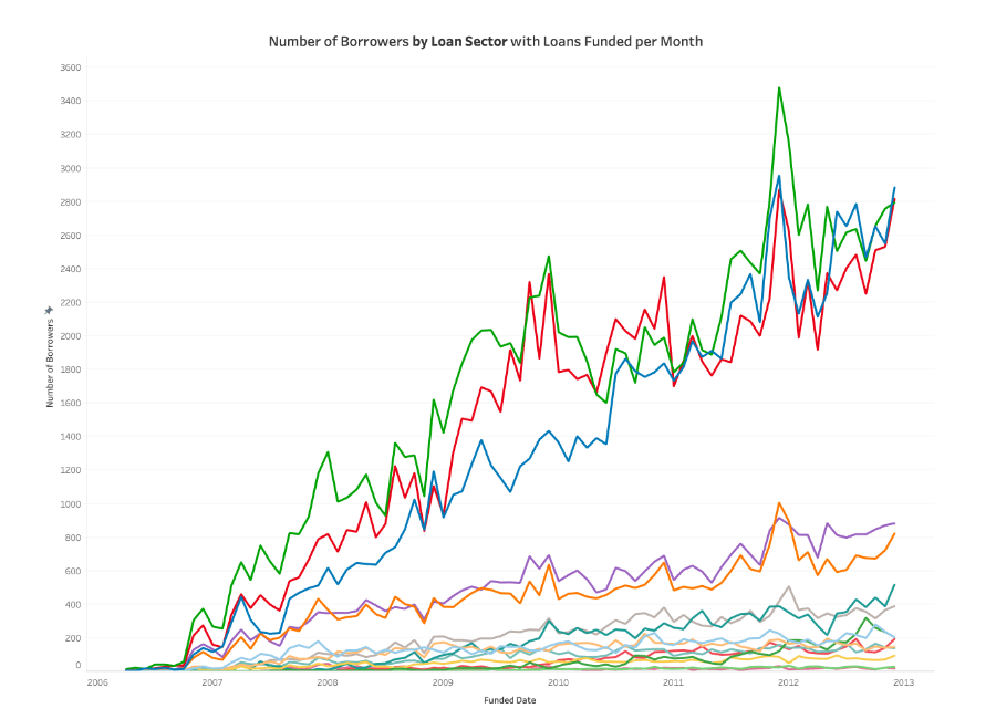
Line charts are excellent for showing trends and changes over time. They help visualize continuous data, especially when you need to highlight how a value fluctuates over a period.
- When to Use:
Line charts are perfect when you need to display changes in data over time. Whether you are tracking stock prices, website traffic, or revenue growth, line charts can easily capture the trajectory of data points. - Advantages:
- Great for showing trends and patterns.
- Can display multiple series simultaneously for comparison (using multiple lines).
- Easy to identify upward, downward, or flat trends.
- Considerations:
- Line charts can become crowded if too many lines are added.
- Not suitable for categorical data or data with significant gaps.
Best Practices:
- Use a limited number of lines for clarity.
- Choose contrasting colors for each line, especially when comparing multiple data series.
- Label the x-axis with time intervals (e.g., months, days) for clarity.
3. Pie Charts: Proportions and Percentages
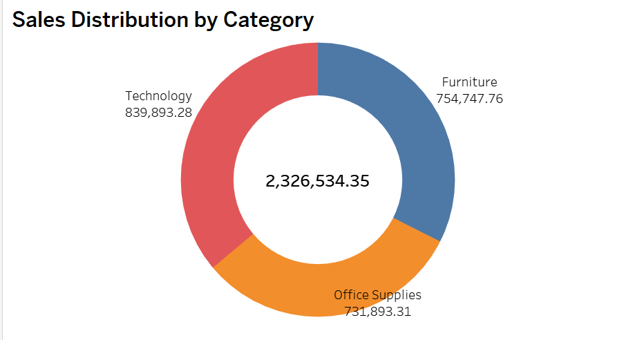
Interested in building a donut chart like shown above? check out this post
Pie charts are often used to show the proportion of parts to a whole. They provide a clear visual representation of how individual categories contribute to a total.
- When to Use:
Use pie charts when you want to show how different categories compare to the whole. For example, if you are showing market share for a set of companies, a pie chart can effectively represent the percentage each company holds. - Advantages:
- Visually simple and intuitive.
- Clearly conveys percentage relationships between categories.
- Considerations:
- Not effective for displaying precise comparisons, as it’s difficult to compare the size of slices accurately.
- Avoid using too many categories (more than 5-6 slices) as it can become cluttered and hard to interpret.
Best Practices:
- Limit the number of slices to avoid clutter.
- Use contrasting colors for each slice to make them easily distinguishable.
- Avoid using 3D pie charts, as they can distort perception.
4. Scatter Plots: Revealing Relationships Between Variables
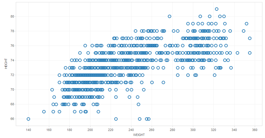
Scatter plots are essential for visualizing the relationship between two continuous variables. They help identify patterns, correlations, and outliers in the data.
- When to Use:
Use scatter plots when you want to show how one variable affects another. For example, you might use a scatter plot to display the correlation between advertising spend and sales revenue. - Advantages:
- Excellent for identifying correlations and trends.
- Helps visualize outliers or anomalies in the data.
- Considerations:
- Can become messy with too many data points.
- Not suitable for categorical data.
Best Practices:
- Include a trend line or regression line to make the relationship clearer.
- Ensure the axes are scaled appropriately for better visibility of data points.
- Highlight any outliers or anomalies for further analysis.
5. Heatmaps: Understanding Patterns and Density
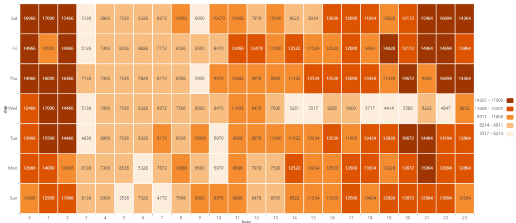
Heatmaps use color gradients to represent the intensity of data values across a matrix. These are particularly effective for visualizing large data sets and identifying clusters of activity.
- When to Use:
Heatmaps are useful for showing patterns across two categorical variables, such as customer activity over different days of the week or sales performance across regions and product categories. - Advantages:
- Easy to spot patterns and trends.
- Effective for displaying a large amount of data in a compact space.
- Considerations:
- The color scheme must be carefully selected to avoid confusion (e.g., red could imply negative results, but blue could mean cold temperatures).
- Too many categories or data points can overwhelm the user.
Best Practices:
- Use a consistent color palette that enhances readability.
- Limit the number of categories to keep the heatmap comprehensible.
- Provide a legend to interpret the color gradients.
6. Histograms: Visualizing Distribution
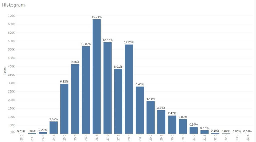
Histograms are used to show the distribution of a dataset and how frequently data points occur within defined ranges or bins.
- When to Use:
Histograms are most effective when you want to display the distribution of a continuous variable, such as age, income, or time spent on a website. - Advantages:
- Good for identifying the frequency of data points within specific intervals.
- Helps to understand the shape of the data distribution (e.g., normal, skewed).
- Considerations:
- Choose appropriate bin sizes for the data to avoid over-simplification or too much detail.
- Not suitable for categorical data.
Best Practices:
- Make sure bins are consistent and appropriate for the dataset.
- Label the x-axis with the range of values in each bin for clarity.
- Include a frequency count or percentage for each bin to enhance understanding.
7. Box Plots: Understanding Data Spread
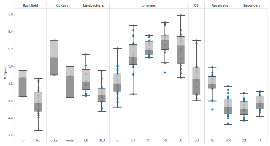
Box plots (or box-and-whisker plots) display the distribution of a dataset through its quartiles. They are useful for understanding the spread, central tendency, and presence of outliers in the data.
- When to Use:
Box plots are great for comparing distributions across different categories or groups. For instance, comparing test scores across multiple classrooms. - Advantages:
- Excellent for identifying outliers.
- Provides a summary of the data distribution, including median, quartiles, and potential outliers.
- Considerations:
- Can be harder to interpret for non-technical audiences.
- Not as intuitive as other chart types for people unfamiliar with statistical concepts.
Best Practices:
- Label quartiles and outliers for easy reference.
- Use multiple box plots for side-by-side comparisons of different groups.
- Avoid cluttering the chart with too many categories.
Conclusion: Selecting the Right Chart for Your Data
Choosing the right chart type is a critical decision for data analysts. It’s not just about making the data look good—it’s about making the data understandable. When selecting a chart, always consider the nature of your data (categorical vs. continuous), the message you want to convey, and your audience’s familiarity with the data.
By understanding the strengths and weaknesses of different chart types and following best practices, you can ensure your visualizations provide meaningful insights that resonate with your audience.
For more tips on data visualization and Power BI techniques, stay tuned to our blog!
Discover more from Daily BI Talks
Subscribe to get the latest posts sent to your email.