
If you’ve ever stared at a blank Tableau dashboard wondering how to move beyond bar and line charts — you’re not alone.
Sure, those basics serve a purpose. But data storytelling is about more than ticking boxes. It’s about helping your audience see the story behind the numbers. That’s why I started building a personal catalog of unique, visually engaging Tableau chart types — and now I’m sharing them with you.
This article is your gateway to a growing library of custom chart tutorials — all built from scratch, with real examples, visual polish, and step-by-step instructions. Whether you’re a data analyst trying to impress stakeholders or a Tableau beginner who wants to learn something new, there’s something here for you.
Why Build a Custom Tableau Chart?
Before we dive into the catalog, let’s answer the real question: Why reinvent the wheel?
Because the wheel isn’t always enough. Stakeholders remember dashboards that show insights differently. They connect with visuals that simplify complexity. And sometimes, adding a bit of creativity can turn a forgettable report into a conversation starter.
In this catalog, you’ll find charts that:
- Replace crowded visuals with clarity
- Highlight change, flow, or comparisons more intuitively
- Add visual charm without sacrificing function
- Help you learn new Tableau tricks and charting logic
Now, let’s dive in.
🗂️ Chart Catalog: Tutorials with Context, Steps & Links
Each chart below includes:
- When to use it
- Why it works
- A brief breakdown of how to build it
- A link to the full tutorial for hands-on learning
🪢 Parallel Set Chart
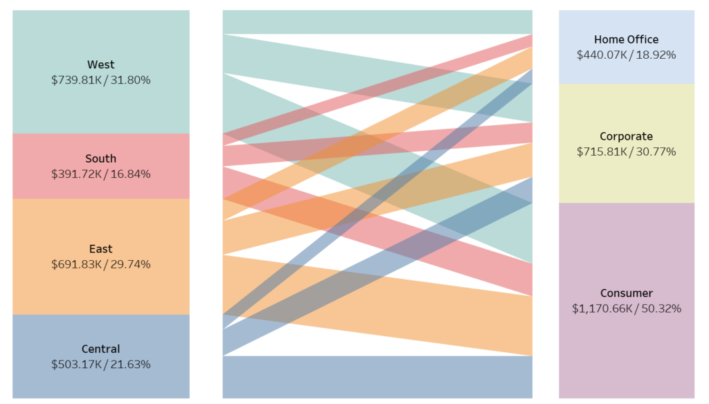
Use it for: Showing how values flow across multiple categories — similar to a simplified Sankey diagram.
Why it’s useful: Great for exploring customer journeys, process funnels, or multi-stage segmentation.
How it’s built:
- Duplicate dimensions for each stage
- Use path index and binning logic to create “curves”
- Adjust size to show proportional flow
🧭 Polar Chart
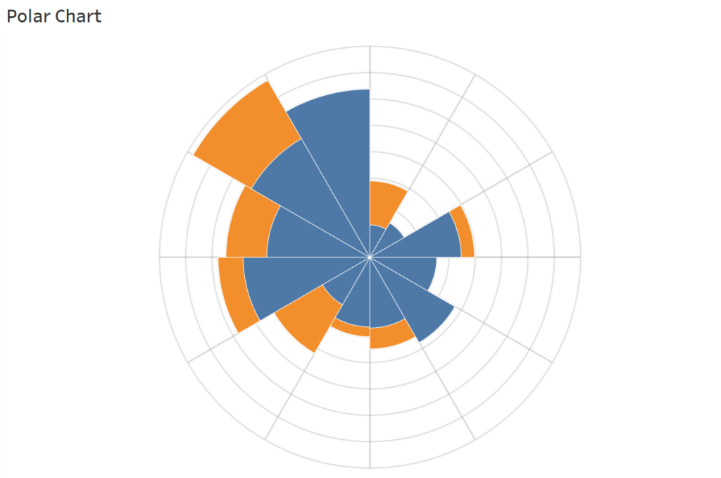
Use it for: Cyclical patterns like months, hours, seasons, or repeating events.
Why it’s eye-catching: Radial layouts help make temporal trends easier to compare — especially across time-based categories.
Key steps:
- Use trigonometric calculations (SIN/COS) for X and Y placement
- Map dimensions to angles
- Customize radii for category weight
🧩 Hex Tile Grid Map
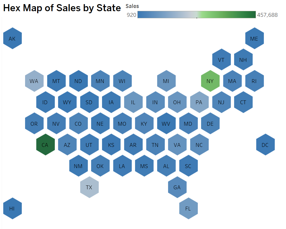
Use it for: Displaying geographic data in a compact and consistent grid — ideal when regional area size distorts data.
Why it matters: Hex maps are easier to compare at-a-glance, especially in dashboard tiles.
How it works:
- Load a hex grid template
- Join with your data by region (e.g., U.S. states)
- Plot polygons using a generated path
📐 Tilted Bar Chart
Use it for: Adding stylistic flair to category comparisons, especially in infographic-style dashboards.
Why use it: It’s simple but visually impactful — and shows off your design thinking.
Steps to try:
- Use polygons instead of bars
- Tilt the layout using calculated XY coordinates
- Format borders and shading for visual texture
🍭 Lollipop Chart
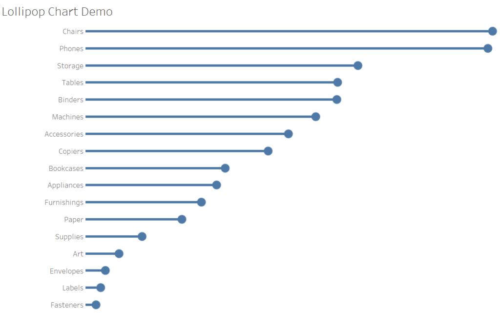
Use it for: Cleaner, less cluttered alternatives to bar charts.
Why it works: Lollipop charts emphasize endpoints over bar width — ideal for minimal dashboards.
Key steps:
- Create a bar on one axis and circle on another
- Synchronize axes
- Hide headers, and enhance with subtle labels
🍩 Donut Bar Chart

Use it for: Proportional comparisons that require more visual impact than pie charts.
What makes it special: With the right spacing and center label, it delivers both clarity and visual flair.
How to create:
- Build a pie chart
- Add a blank center circle via dual axis
- Style the segments and center total
🧱 Unit Progress Bar
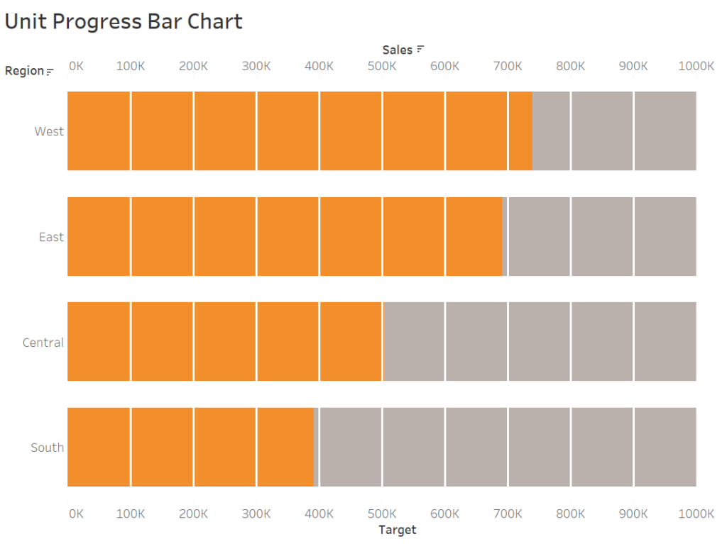
Use it for: Progress tracking — think fundraising goals, milestones, task completion.
Why it stands out: Each “unit” is a piece of the story, and the whole bar is made up of visible individual components.
How to do it:
- Create a scaffold data set
- Use calculated index to determine fill level
- Apply color coding and optional icons
🦋 Diverging Bar (Butterfly) Chart
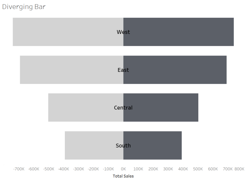
Use it for: Side-by-side comparisons — gender split, sentiment change, before/after.
Why people love it: It’s symmetrical, intuitive, and super easy to read.
Quick build:
- Assign negative values to one group
- Align shared dimension in the center
- Format labels, borders, and axis precision
🏋️ Dumbbell Chart
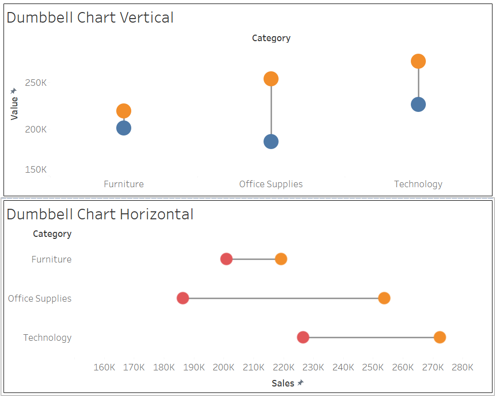
Use it for: Highlighting differences between two metrics (e.g., current vs. target).
Why it works: Viewers see both values and the difference clearly in a single glance.
Key technique:
- Plot both values using dual axes
- Connect them with a line or path
- Style circles and spacing for consistency
🧊 Rounded Bar & Bar-in-Bar
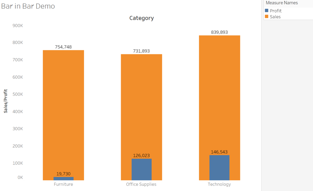
Use it for: Comparing two values (actual vs. benchmark) within a clean layout.
Why it’s sleek: Rounded ends soften the visual — great for modern dashboards.
To build:
- Use two overlapping bars
- Adjust radius or shape marks
- Set contrasting widths and colors
🧇 Waffle Chart
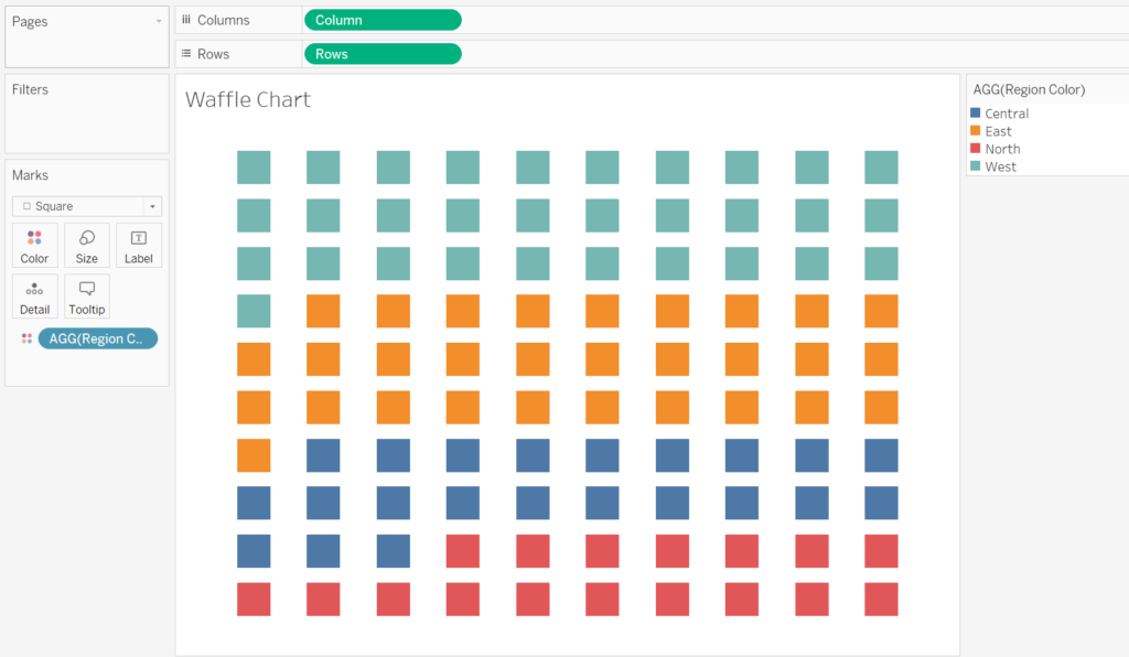
Use it for: Showing a percentage out of 100 in a clear, geometric layout.
Why it’s powerful: It’s easier to interpret than pie charts and looks great in mobile or square layouts.
Steps:
- Scaffold a 10×10 grid
- Use logic to fill each cell based on value
- Color and space with visual hierarchy
🔍 Why Use This Catalog?
This guide isn’t just a list — it’s a structured toolkit for:
- Picking the right chart for the right story
- Learning core Tableau charting techniques
- Improving your dashboard design
You’ll get clear, repeatable steps that work with real datasets like Superstore or your own production data.
📌 Save, Share & Subscribe
This catalog will keep growing. I’ll be adding more chart types as I experiment with layouts and take on new dashboard challenges.
To stay in the loop:
- 🔗 Bookmark the Visualization section
- 💌 Subscribe for future updates
- 💬 Comment or DM me if there’s a chart you’d love to see next
🧠 Final Thought
Great dashboards don’t just present data — they guide people to the insight. If one of these charts helps make your dashboard clearer, more memorable, or just more fun to build, then this catalog has done its job.
Discover more from Daily BI Talks
Subscribe to get the latest posts sent to your email.