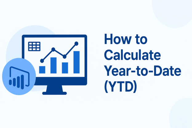
When analyzing sales performance, executives often ask:
“How are we performing so far this year compared to last year?”
That question can be answered easily if you know how to calculate Year-to-Date (YTD) values in Power BI.
Continue reading
When analyzing sales performance, executives often ask:
“How are we performing so far this year compared to last year?”
That question can be answered easily if you know how to calculate Year-to-Date (YTD) values in Power BI.
Continue reading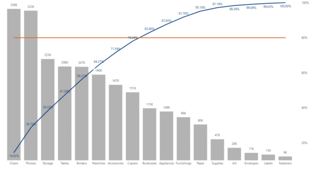
A Pareto chart is a powerful visualization that combines both bar and line charts to identify the most significant factors in a dataset. Named after the Pareto principle (also known as the 80/20 rule), it helps users focus on the causes that generate the majority of results. In this article, we’ll walk through how to build a Pareto chart in Power BI using the Superstore dataset, a common sample dataset used in data visualization training.
Continue reading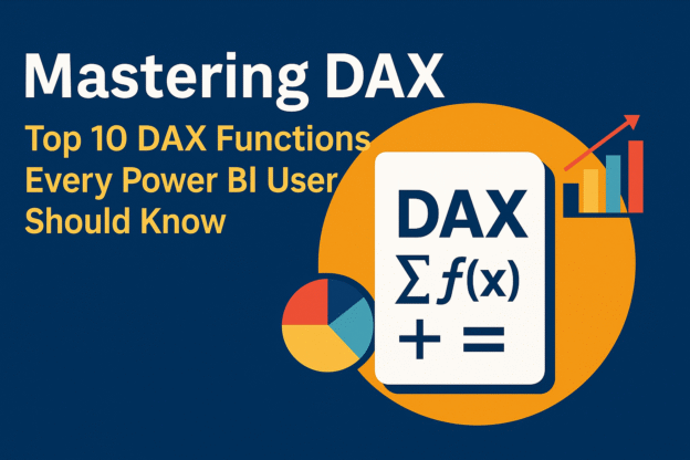
When working with Power BI, mastering DAX (Data Analysis Expressions) is essential for unlocking advanced analytics and building dynamic, interactive reports. DAX is the formula language used to perform calculations, aggregations, and analysis within Power BI. Whether you’re a beginner or an advanced user, understanding the top DAX functions for Power BI is critical to transforming your data and gaining valuable insights.
Continue reading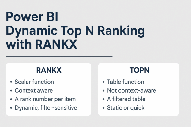
In Power BI, effectively ranking data is crucial for insightful analysis. Two primary DAX functions facilitate this: TOPN and RANKX. While both serve to rank data, they operate differently and are suited for distinct scenarios.
Continue reading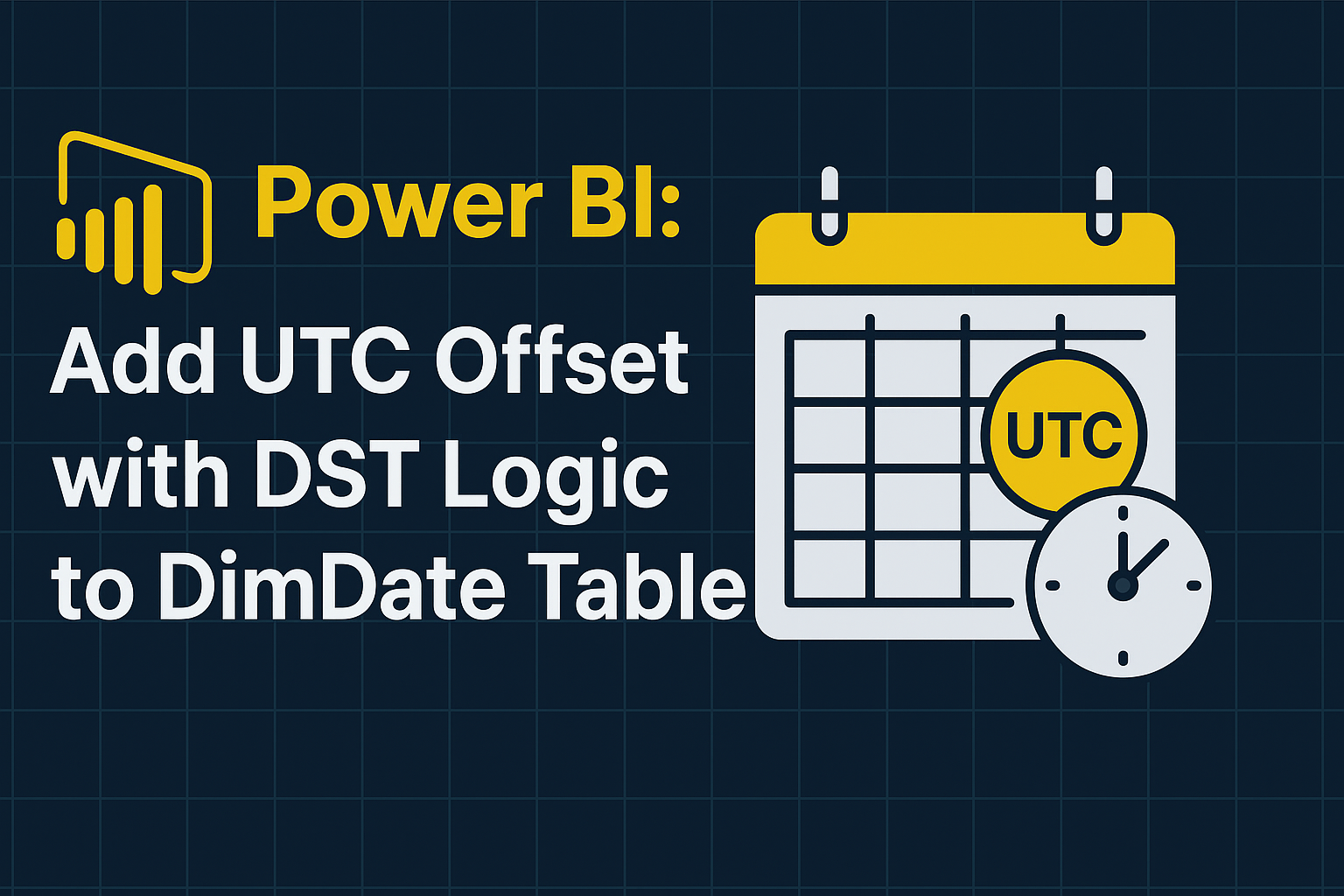
When working with datasets containing UTC timestamps, especially across multiple U.S. locations, it’s important to convert UTC time to the correct local time based on time zone and daylight saving time (DST) rules.
Continue reading
In the dynamic world of business analytics, understanding trends over time is crucial. Power BI’s Time Intelligence Functions empower users to perform complex time-based calculations with ease, transforming raw data into actionable insights. This blog explores key Time Intelligence Functions, complete with examples and real-world applications.
Continue reading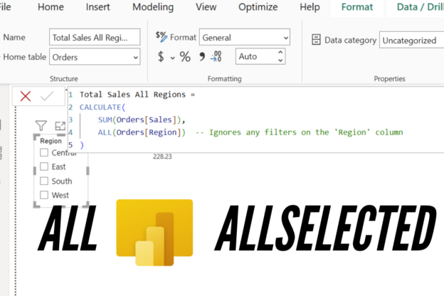
In a previous post about how to use Tableau Exclude LOD in Power BI, we briefly mentioned ALLSELECTED. However, ALLSELECTED is a more powerful and complex function than we covered at that time. In this article, we’ll delve deeper into not only ALLSELECTED but also its counterpart, ALL, to fully understand their capabilities and applications in Power BI.
Continue reading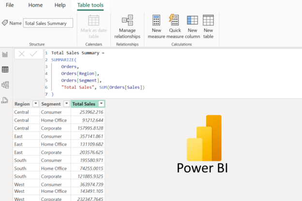
When working with data in Power BI, summarizing and grouping data is essential for gaining insights and preparing reports. These operations allow you to aggregate values, perform calculations, and create custom tables or visuals based on specific grouping conditions.
Continue reading
When working with large datasets in Power BI, efficiency is key. One of the most powerful optimization techniques is query folding, a process that enables Power BI to push transformations back to the data source instead of handling them locally. But what exactly is query folding, and why is it important?
Continue reading
Power BI is one of the most powerful business intelligence tools available, enabling organizations to visualize, analyze, and share insights efficiently. However, as your datasets grow and your reports become more complex, performance can degrade, leading to slow report loading times and a frustrating user experience. To ensure your Power BI reports are fast, responsive, and user-friendly, it’s essential to follow optimization best practices and leverage the right tools. In this article, we’ll explore the best strategies and tools for optimizing Power BI reports.
Continue reading