Tag Archives: Tableau

How to Create Donut Bar in Tableau(Super Easy!) dailybitalks.com

How to Create Donut Bar in Tableau(Super Easy!)

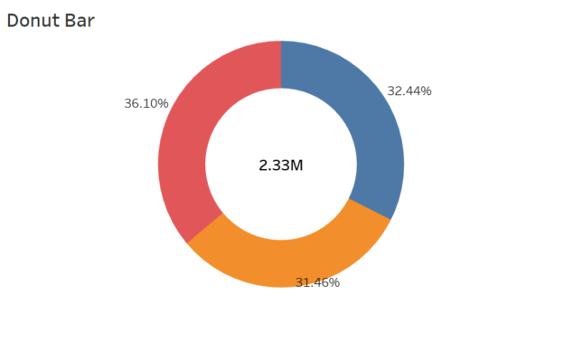
Donut charts are a variation of pie charts that are sleek, visually appealing, and effective for showing proportions or contributions of parts to a whole. The central hole in a donut chart creates space for additional information, such as a total value or key metric, which enhances the chart’s storytelling capability. In this blog post, I’ll guide you step-by-step on how to create a donut chart in Tableau, referencing the best practices from trusted sources.

Continue reading
How to Make Unit Progress Bar Chart in Tableau dailybitalks.com

How to Make Unit Progress Bar Chart in Tableau

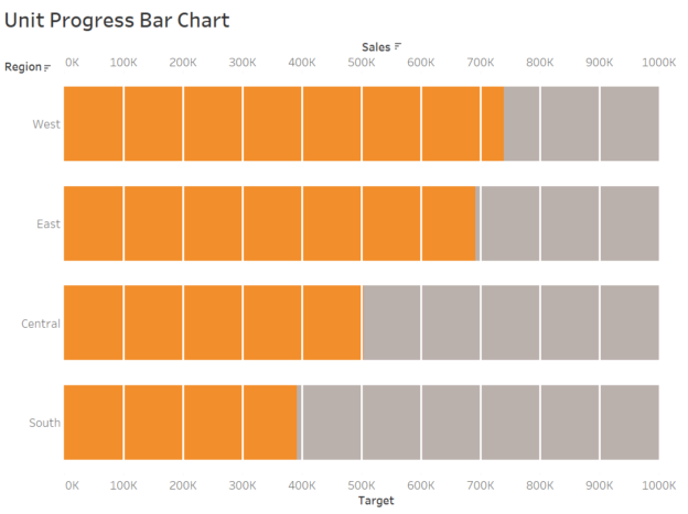
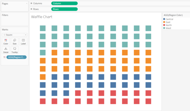
Unit progress bar charts are a fantastic way to represent progress toward a goal, breaking the visualization into smaller units to highlight individual contributions. These charts are both visually appealing and effective for storytelling. In this post, we’ll guide you through the process of creating a unit progress bar chart in Tableau using the Superstore dataset.

Continue reading
How to Create Dumbbell Chart(Horizontally and Vertically) in Tableau dailybitalks.com

How to Create Dumbbell Chart(Horizontally and Vertically) in Tableau

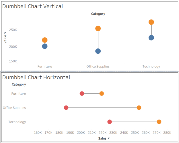
Dumbbell charts are a fantastic visualization tool for comparing two data points across categories while emphasizing the difference between them. Often used to show progress or change over time, these charts highlight how values diverge or converge for each category. In this blog post, we’ll walk you through how to create a dumbbell chart in Tableau using the Superstore dataset.

Continue reading
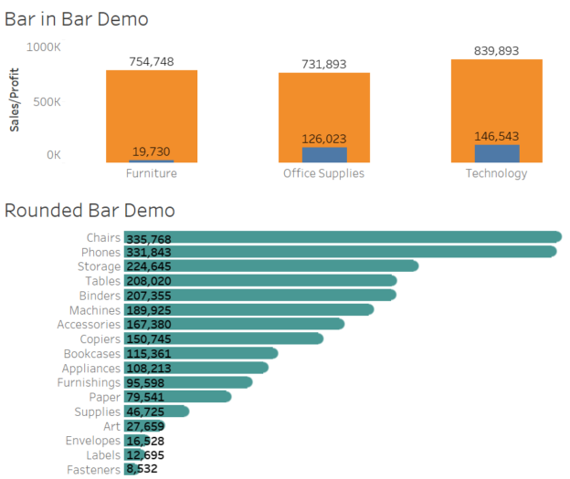
How to Create Rounded Bar and Bar in Bar in Tableau dailybitalks.com

How to Create Rounded Bar and Bar in Bar in Tableau

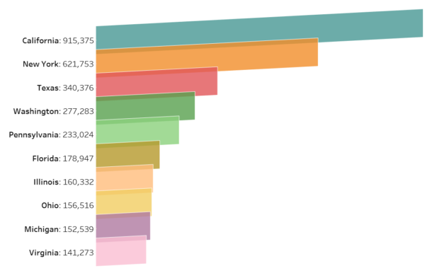
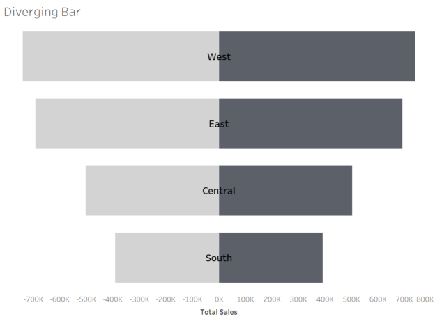
In data visualization, the right design can make your insights not just clearer but also more engaging. Rounded bar charts and bar-in-bar charts are two excellent options for adding polish and depth to your dashboards. These chart types bring a modern touch to traditional visuals while enhancing storytelling and usability. In this blog post, we’ll use Tableau’s Superstore dataset to create these charts and discuss their applications.

Continue reading
Conduct Tableau Predictive Analysis Functions in Time Series Visualizations dailybitalks.com

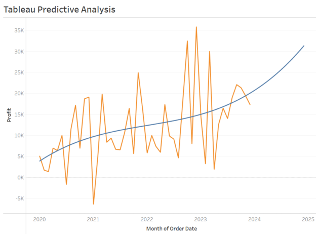
How to Conduct Tableau Predictive Analysis Functions in Time Series Visualizations

Predictive analytics is a powerful tool that transforms raw data into actionable insights, enabling data-driven decision-making. With Tableau’s predictive modeling functions, you can extend time axes, forecast trends, and identify future opportunities. This article walks you through creating predictions in Tableau and explores how to choose the right predictive model for your analysis.

Continue reading
Tableau forecasting dailybitalks.com

A Comprehensive Guide to Tableau Forecasting Methods

Forecasting is a powerful tool in analytics, allowing businesses to make data-driven predictions about future trends and performance. Tableau, a leading data visualization platform, provides robust forecasting capabilities that are easy to use yet sophisticated enough to handle complex data. By integrating statistical models directly into its visualizations, Tableau empowers users to forecast trends and display them in an intuitive manner.

Continue reading
How to Convert Degree Minute Second (DMS) to Latitude and Longitude in Tableau dailybitalks.com

How to Convert Degree Minute Second (DMS) to Latitude and Longitude in Tableau

Geographic data is often stored in a Degree-Minute-Second (DMS) format, making it a bit tricky to convert into the standard decimal degrees (DD) required for Tableau’s mapping functions. In this post, I’ll walk you through how to transform DMS coordinates to decimal degrees directly in Tableau, step-by-step, so you can plot your geographic data without headaches.

Continue reading