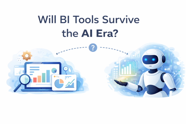
Tag Archives: Visualization

How to Make Unit Progress Bar Chart in Tableau dailybitalks.com

How to Make Unit Progress Bar Chart in Tableau

Unit progress bar charts are a fantastic way to represent progress toward a goal, breaking the visualization into smaller units to highlight individual contributions. These charts are both visually appealing and effective for storytelling. In this post, we’ll guide you through the process of creating a unit progress bar chart in Tableau using the Superstore dataset.

Continue reading
How to Create Dumbbell Chart(Horizontally and Vertically) in Tableau dailybitalks.com

How to Create Dumbbell Chart(Horizontally and Vertically) in Tableau

Dumbbell charts are a fantastic visualization tool for comparing two data points across categories while emphasizing the difference between them. Often used to show progress or change over time, these charts highlight how values diverge or converge for each category. In this blog post, we’ll walk you through how to create a dumbbell chart in Tableau using the Superstore dataset.

Continue reading
How to Create Rounded Bar and Bar in Bar in Tableau dailybitalks.com

How to Create Rounded Bar and Bar in Bar in Tableau

In data visualization, the right design can make your insights not just clearer but also more engaging. Rounded bar charts and bar-in-bar charts are two excellent options for adding polish and depth to your dashboards. These chart types bring a modern touch to traditional visuals while enhancing storytelling and usability. In this blog post, we’ll use Tableau’s Superstore dataset to create these charts and discuss their applications.

Continue reading
Conduct Tableau Predictive Analysis Functions in Time Series Visualizations dailybitalks.com

How to Conduct Tableau Predictive Analysis Functions in Time Series Visualizations

Predictive analytics is a powerful tool that transforms raw data into actionable insights, enabling data-driven decision-making. With Tableau’s predictive modeling functions, you can extend time axes, forecast trends, and identify future opportunities. This article walks you through creating predictions in Tableau and explores how to choose the right predictive model for your analysis.

Continue reading
Tableau forecasting dailybitalks.com

A Comprehensive Guide to Tableau Forecasting Methods

Forecasting is a powerful tool in analytics, allowing businesses to make data-driven predictions about future trends and performance. Tableau, a leading data visualization platform, provides robust forecasting capabilities that are easy to use yet sophisticated enough to handle complex data. By integrating statistical models directly into its visualizations, Tableau empowers users to forecast trends and display them in an intuitive manner.

Continue reading
How to Synchronize Primary and Secondary Y-Axis in Power BI dailybitalks.com

Power BI Tips: How to Synchronize Primary and Secondary Y-Axis in Power BI Line Charts

When working with Power BI line charts, you may want to display two data series with different scales using dual Y-axes (primary and secondary Y-axis). However, if the scales don’t match, it can make your chart confusing and potentially misleading. To ensure your data is accurately represented, synchronizing the Y-axes by setting consistent minimum and maximum values is key. This guide will walk you through the steps to synchronize the primary and secondary Y-axes specifically for Power BI line charts.

Continue reading
Power BI Tips: How to Sync Slicers on Power BI Dashboard dailybitalks.com

Power BI Tips: How to Sync Slicers on Power BI Dashboard

Power BI slicers are powerful tools for making data more interactive and customizable within reports. They allow users to filter visuals on the dashboard by selecting specific criteria, making it easy to narrow down data for quick insights. In this article, we’ll dive into what Power BI slicers are, how to set them up, and how to sync them across multiple pages to create a seamless user experience.

Continue reading
How to Extract Background Images from Power BI (PBIX) Files: A Step-by-Step Guide dailybitalks.com

How to Extract Background Images from Power BI (PBIX) Files: A Step-by-Step Guide

Power BI is a powerful tool for data visualization, and often, users integrate background images, icons, and visuals to create custom dashboards that elevate the storytelling behind the data. But what if you need to extract these images from a PBIX file? While Power BI Desktop doesn’t offer a built-in method for image extraction, there’s a clever trick that allows you to extract embedded images and backgrounds.

Continue reading