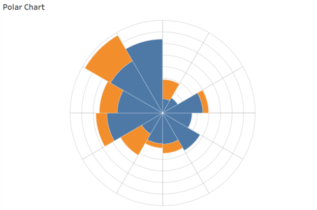
Tag Archives: Visualization

The Complete Likert Scale and NPS Power BI Tutorial

The Complete Likert Scale and NPS Power BI Tutorial

If you’ve read my previous tutorial on creating Likert Scale and NPS scores in Tableau, you might have found yourself wondering: how can I achieve the same in Power BI? The good news is, Power BI offers a straightforward way to replicate this process while leveraging its powerful visualization and data modeling features.

Continue reading
dailybitalks.com The Complete Likert Scale and NPS Tableau Tutorial

The Complete Likert Scale and NPS Tableau Tutorial(Part 2)

Be sure to check out my previous article on creating a Likert scale, as we’ll be using the same restaurant survey dataset. However, we won’t be using any of the calculated fields from the Likert scale, so feel free to skip it if you’d like. That said, the final dashboard will feature both the Likert and NPS charts side by side—they always pair well together, don’t you think?

Continue reading
dailybitalks.com The Complete Likert Scale and NPS Tableau Tutorial

The Complete Likert Scale and NPS Tableau Tutorial(Part 1)

Surveys are powerful tools for gathering feedback and insights, with Likert scales and Net Promoter Score (NPS) being two popular methods for measuring attitudes, opinions, and customer satisfaction. Likert scales assess the level of agreement or disagreement on a statement, while NPS measures customer loyalty by asking how likely respondents are to recommend a product or service.

Continue reading