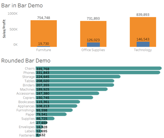
In data visualization, the right design can make your insights not just clearer but also more engaging. Rounded bar charts and bar-in-bar charts are two excellent options for adding polish and depth to your dashboards. These chart types bring a modern touch to traditional visuals while enhancing storytelling and usability. In this blog post, we’ll use Tableau’s Superstore dataset to create these charts and discuss their applications.
Continue reading