
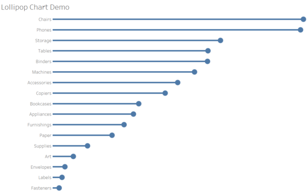
Lollipop charts are a fun and visually engaging way to display data. They combine the simplicity of a bar chart with the precision of a scatter plot, making it easy to highlight specific data points. In this tutorial, we’ll create a lollipop chart in Tableau using the Superstore dataset to showcase sales performance across categories.
What is a Lollipop Chart?
A lollipop chart is essentially a bar chart with a circle (or “lollipop”) at the end of each bar. This format provides the dual benefits of clearly showing trends while focusing attention on the endpoints of the data.
Step 1: Connect to the Superstore Dataset
- Open Tableau Desktop and connect to the Sample – Superstore data source.
- Navigate to Sheet 1.
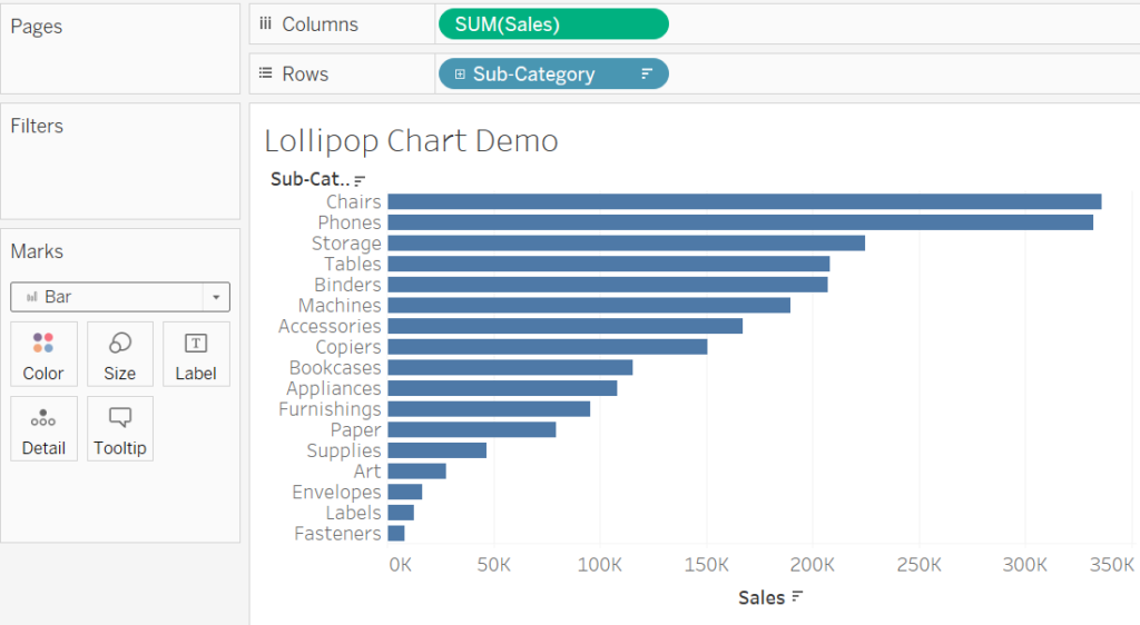
Step 2: Build the Foundation (Bar Chart)
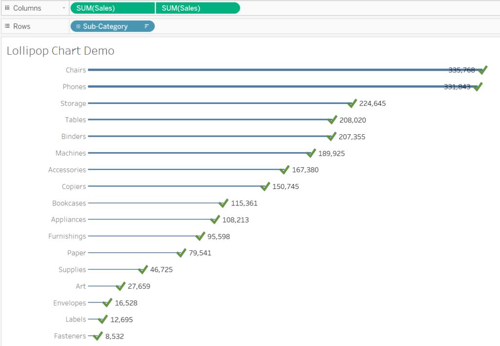
- Drag the Sub-Category dimension to the Rows shelf.
- Drag the Sales measure to the Columns shelf.
- Sort the chart in descending order by clicking the sort icon on the Sales axis.
- Change the mark type to Bar in the Marks card.
At this stage, you have a simple bar chart showing total sales by category.
Step 3: Add the Lollipop (Circle Mark)
- Drag Sales again to the Columns shelf. (Quick hack: Ctrl+Click+Drag to copy a field )
- Right-click the second SUM(Sales) axis on the right and select Dual Axis.
- On the Marks card, click the dropdown for the second SUM(Sales) axis and change the mark type to Shape. Also check the first Sum(Sales) axis, making sure it has bar selected.
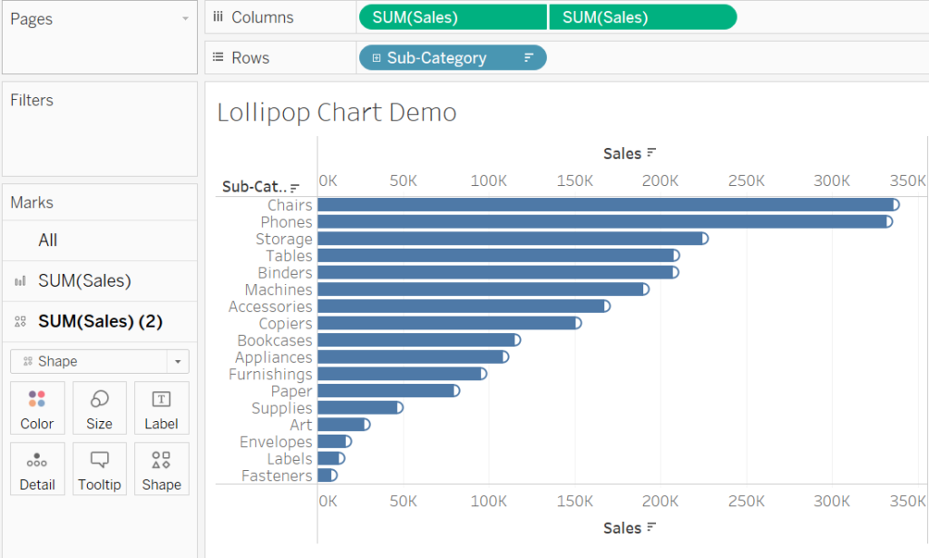
Step 4: Synchronize Axes
- Right-click the secondary axis (on the right) and select Synchronize Axis.
- Hide the secondary axis by right-clicking and deselecting Show Header.
Now, you’ll see a bar chart with circles at the end of each bar.
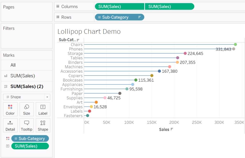
Step 5: Customize the Chart
- Adjust the size of the bars and Shape:
- Select the Bar mark type and reduce its size using the slider on the Marks card.
- Select the Shape mark type and adjust its size to make it stand out.
- Add color:
- Drag Sub-Category to the Color shelf for the Shape mark type.
- Keep the bars in a neutral color to emphasize the circles.
- Add labels:
- Drag Sales to the Label shelf for the Shape mark type to display the sales value for each category.
Step 6: Final Touches
- Adjust formatting to improve readability:
- You can add a descriptive title, e.g., “Sales by Category: Lollipop Chart.”
- Format the axis labels and gridlines for a clean look.
- You can also change another shape to make it even more fun and creative.
Why Use Lollipop Charts?
Lollipop charts are ideal for:
- Highlighting specific data points while maintaining the context of the whole dataset.
- Making visualizations more engaging and less cluttered than traditional bar charts.
- Presenting categorical data in a creative and clear way.
Discover more from Daily BI Talks
Subscribe to get the latest posts sent to your email.