
Radar charts, also called spider charts, are great for comparing multiple variables across categories. While Tableau doesn’t natively support radar charts, you can still build one using calculated fields and some data reshaping.
In this tutorial, we’ll create a radar chart that compares Sales by Sub-Category using the Sample – Superstore dataset.
Step 1: Open and Connect to the Dataset
- Open Tableau Desktop.
- Connect to the Sample – Superstore dataset (available with Tableau).
- Go to Sheet 1.
Step 2: Filter and Prepare Your Data
We’ll use a simplified example: visualize Sales by Region using a radar chart.
- Drag Sub-Category to Rows.
- Drag Sales to Columns to get a sense of the data.
- Take note of how many Sub-Categories you have – we’ll need this to calculate angles.
There are 4 regions in Superstore.
Step 3: Create Calculated Fields for the Radar Chart
We’ll plot points on a circle using trigonometry. That requires calculating an angle for each Sub-Category, then computing X and Y coordinates based on Sales.
3.1. Create an Index Field
We need to assign each Sub-Category a unique index.
- Go to the top menu → Analysis → Create Calculated Field.
- Name it:
Index - This assigns each Region a number from 1 to N (4 in our case).
INDEX()3.2. Create Angle in Radians
- Name:
Angle - This determines the position of each point around the circle:
2 * PI() * ([Index] - 1) / SIZE()3.3. Normalize Sales for Consistency
You don’t want sales values to break the chart, so normalize them, it scales all values to max = 1::
- Name:
Sales (Normalized)
SUM([Sales]) / WINDOW_MAX(SUM([Sales]))3.4. Compute X and Y Coordinates
X Coordinate
[Normalized Sales] * SIN([Angle])Y Coordinate
[Normalized Sales] * COS([Angle])Step 4: Set up the View
- Drag X to Columns, Y to Rows.
- Change the Mark Type to Polygon.
- Drag Region to Detail on the Marks card.
- Drag Index to Path (this is critical to draw the radar shape in the right order).
- Drag Region again to Color to distinguish the segments.
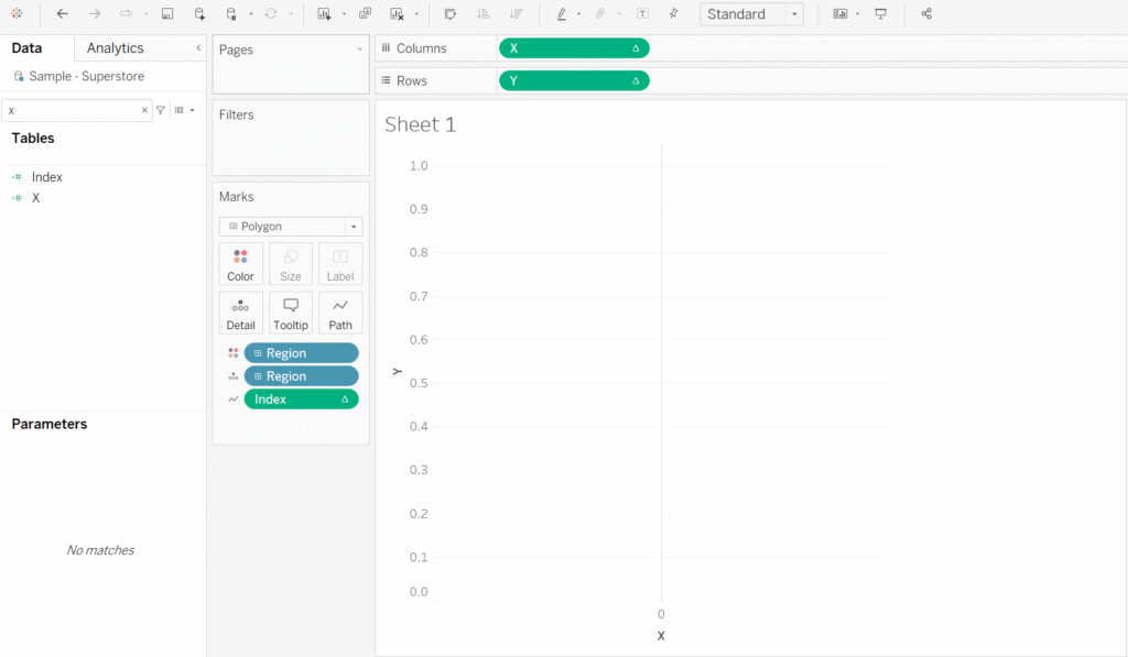
Step 5: Adjust Table Calculation and Sorting
For all calculated fields (Index, Angle, Normalized Sales):
- Right-click → Edit Table Calculation
- Select Compute Using: Region
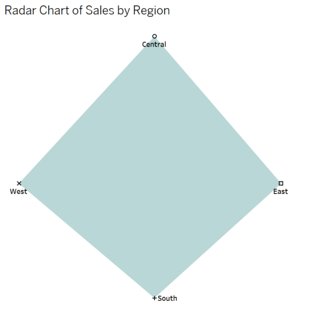
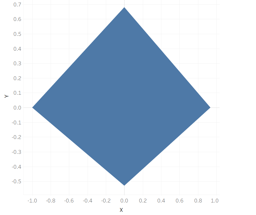
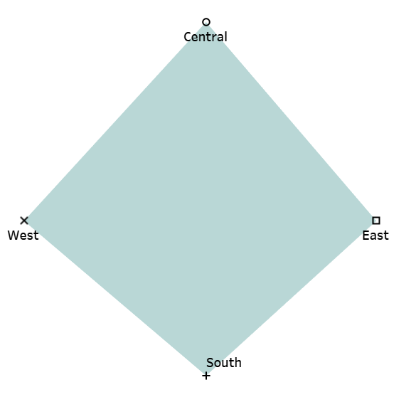
And you have it!
Step 6: Polish the Radar Chart
It looks better, but still a bit messy, so let’s do some polishing.
- Duplicate an Y-axis
- Change one of the two charts to ‘Shape’
- Drag [Region] into ‘Label’
- Drag [Region] into ‘Shape’
- Right-click the [Y-axis] of ‘Shape’ chart > click ‘Dual Axis’ > select ‘Synchronize Axis’
- Add a title like “Radar Chart of Sales by Region”.
Final Notes
- Radar charts are great for comparing across categories but can become cluttered with too many values.
- They work best when categories have similar scales or after normalization.
- For visual appeal, try adding a secondary path (like background radial gridlines) using dual-axis tricks.
Discover more from Daily BI Talks
Subscribe to get the latest posts sent to your email.