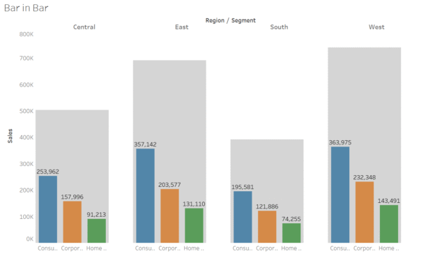
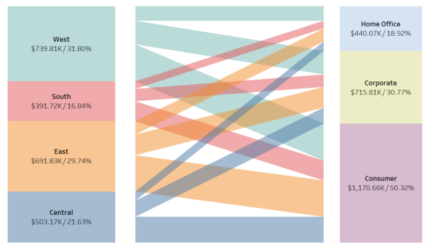
Tag Archives: Tableau

How to Create Hex Polygon/Tile Grid Maps in Tableau dailybitalks.com

How to Create Hex Polygon/Tile Grid Maps in Tableau

Hex maps or Tile grip maps are a visually appealing alternative to traditional geographic maps. They arrange regions or states into a grid of hexagons, standardizing their size and shape while maintaining their relative positioning. This approach eliminates distortion caused by geographic size differences and focuses on comparative analysis.

Continue reading
How to Create Tilted Bar Charts in Tableau dailybitalks.com

How to Create Tilted Bar Charts in Tableau

Tilted bar charts, with their unique slanted orientation, offer a fresh perspective for visualizing comparative data. These charts can help your dashboards stand out while providing insightful visual analysis. In this tutorial, we’ll guide you through creating a tilted bar chart in Tableau using the Sample Superstore dataset.

Continue reading
Tableau Tips: How to Make a Lolipop Chart (out of Plain Bar Chart) dailybitalks.com

Tableau Tips: How to Make a Lollipop Chart (out of Plain Bar Chart)

Lollipop charts are a fun and visually engaging way to display data. They combine the simplicity of a bar chart with the precision of a scatter plot, making it easy to highlight specific data points. In this tutorial, we’ll create a lollipop chart in Tableau using the Superstore dataset to showcase sales performance across categories.

Continue reading
How to Create Donut Bar in Tableau(Super Easy!) dailybitalks.com

How to Create Donut Bar in Tableau(Super Easy!)

Donut charts are a variation of pie charts that are sleek, visually appealing, and effective for showing proportions or contributions of parts to a whole. The central hole in a donut chart creates space for additional information, such as a total value or key metric, which enhances the chart’s storytelling capability. In this blog post, I’ll guide you step-by-step on how to create a donut chart in Tableau, referencing the best practices from trusted sources.

Continue reading
How to Make Unit Progress Bar Chart in Tableau dailybitalks.com

How to Make Unit Progress Bar Chart in Tableau

Unit progress bar charts are a fantastic way to represent progress toward a goal, breaking the visualization into smaller units to highlight individual contributions. These charts are both visually appealing and effective for storytelling. In this post, we’ll guide you through the process of creating a unit progress bar chart in Tableau using the Superstore dataset.

Continue reading
How to Create Dumbbell Chart(Horizontally and Vertically) in Tableau dailybitalks.com

How to Create Dumbbell Chart(Horizontally and Vertically) in Tableau

Dumbbell charts are a fantastic visualization tool for comparing two data points across categories while emphasizing the difference between them. Often used to show progress or change over time, these charts highlight how values diverge or converge for each category. In this blog post, we’ll walk you through how to create a dumbbell chart in Tableau using the Superstore dataset.

Continue reading
How to Create Rounded Bar and Bar in Bar in Tableau dailybitalks.com

How to Create Rounded Bar and Bar in Bar in Tableau

In data visualization, the right design can make your insights not just clearer but also more engaging. Rounded bar charts and bar-in-bar charts are two excellent options for adding polish and depth to your dashboards. These chart types bring a modern touch to traditional visuals while enhancing storytelling and usability. In this blog post, we’ll use Tableau’s Superstore dataset to create these charts and discuss their applications.

Continue reading